Tutorial: Plotting with SpatialMap
Tutorial_Plotting_with_SpatialMap.RmdIntroduction
This vignette is meant to be a comprehensive reference of all the plots you can make using SpatialMap. Many of these functions are also discussed in other vignettes with more context on their analytical role–this tutorial will link to those other vignettes, and will stay focused on plotting parameters.
sm <- load_sm_data("skin")It’s also important to note that the majority of these plotting functions are convenient wrappers around ggplot2 designed to work with SpatialMap objects. This means that the objects returned are ggplot objects that can be modified as needed using ggplot syntax. We’ll indicate through the vignette which functions don’t return ggplot objects.
plotRepresentation
This is one of the main plotting functions for the package. This is used to make scatterplots of single cell data based on various representations (e.g. spatial, PCA, UMAP, etc.). The quickstart guide provides a helpful introduction to how the Representation class works.
Spatial representations
A SpatialMap object has one spatial representation per Region, representing the coordinates of each cell’s centroid. This representation is always linked to a single Region, since the Regions that comprise a SpatialMap object have no inherent spatial relationship to each other. Calling plotRepresentation on a SpatialMap object will create a plot for each Region in that object.
plotRepresentation(sm, representation = "spatial", what = "Region")
#> $Skin1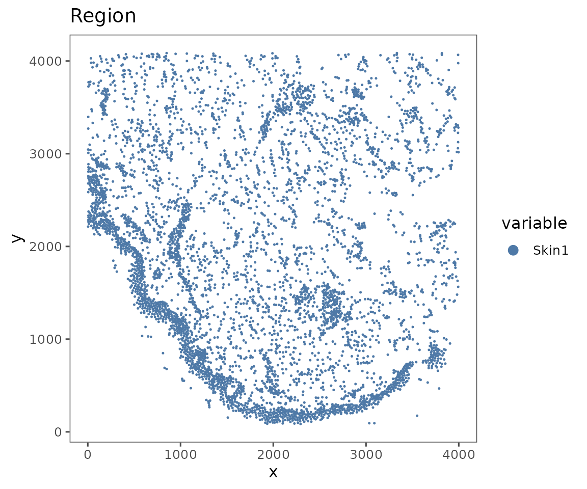
#>
#> $Skin2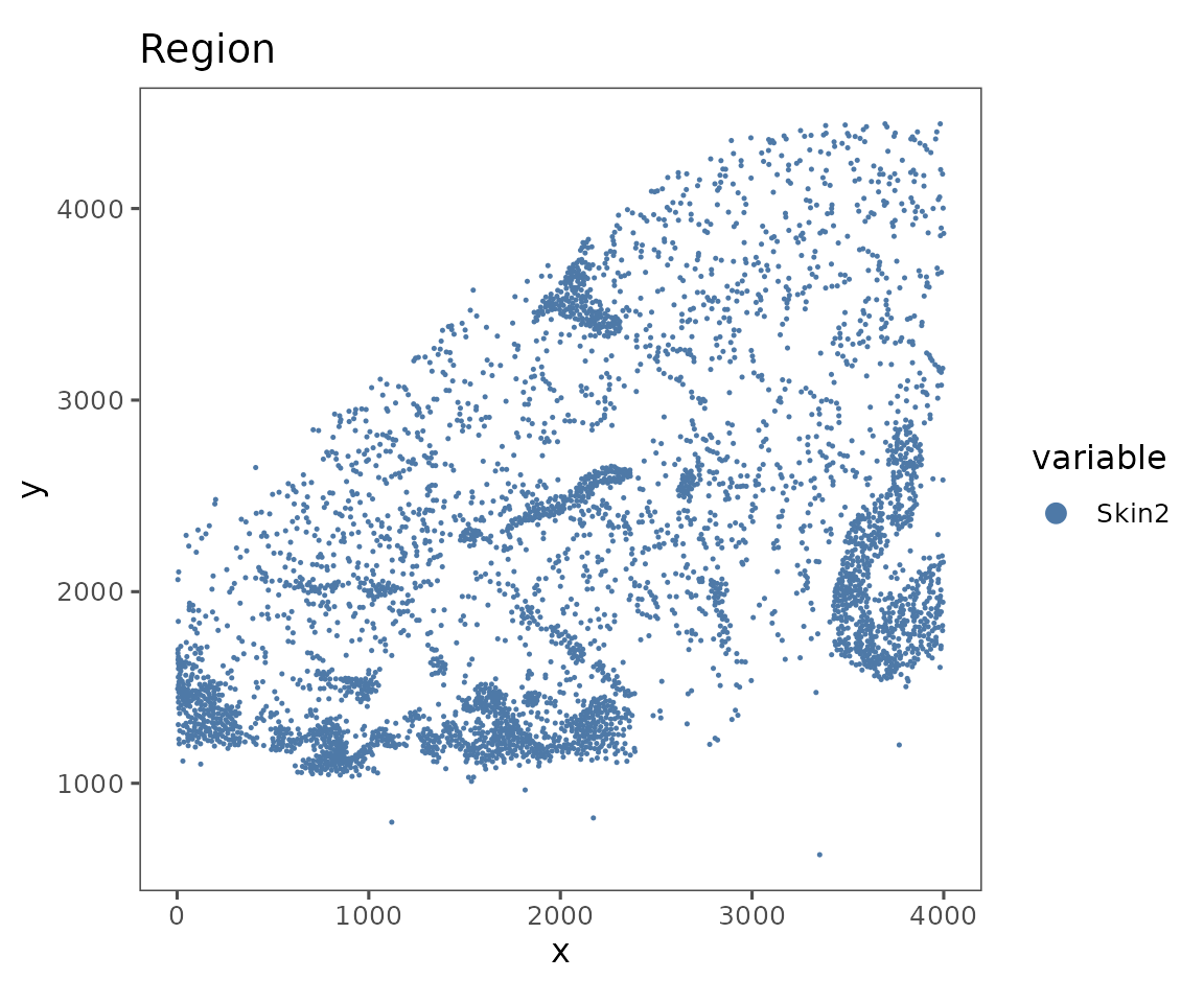
#>
#> $Skin3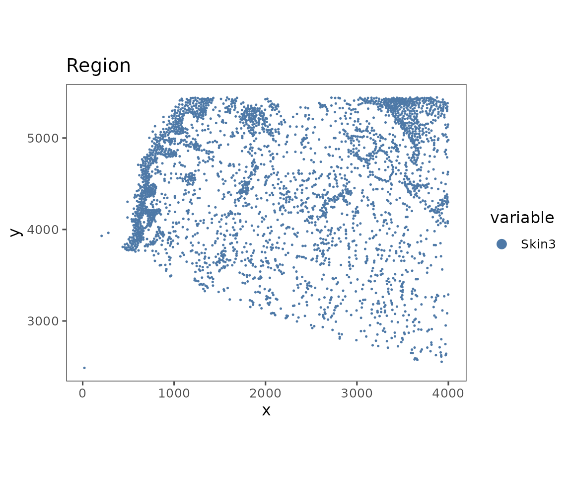
#>
#> $Skin4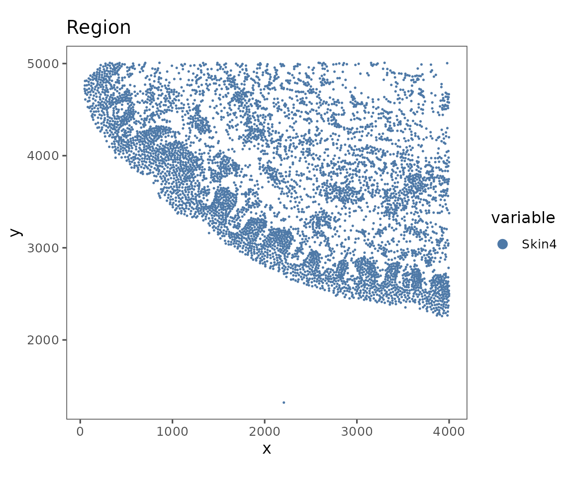
#>
#> $Skin5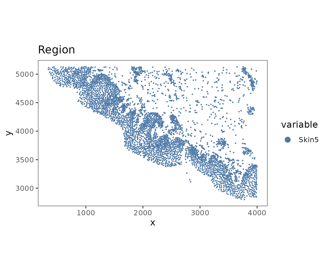
#>
#> $Skin6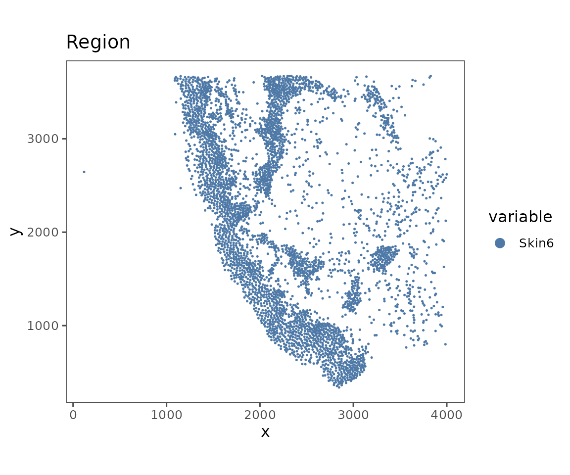
This function takes values to the argument what that specify what to color the plot by.
plotRepresentation(sm[[1]],
                   representation = "spatial",
                   what = "anno540_Phenotype4")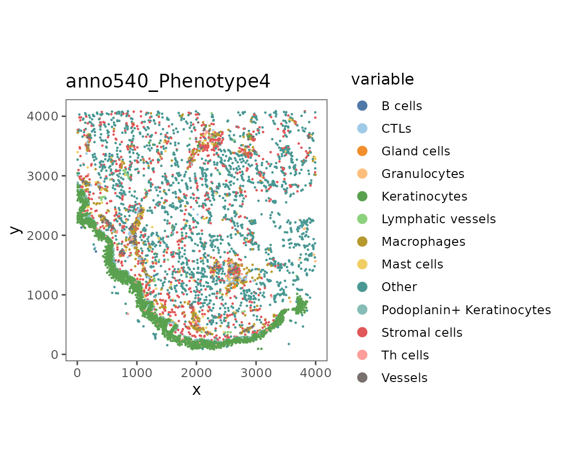
The argument what can take in any parameter in the object’s metadata or data slots. To get a list of the values that can be plotted, look at the results of colnames(cellMetadata(sm)), features(sm), and bgFeatures(sm).
Values that are included in features can come from any of the data slots. To plot these, specify which data.slot you’d like to show.
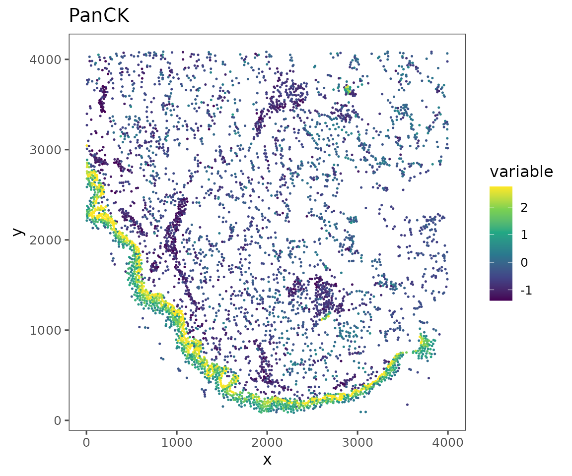
plotRepresentation(sm[[1]],
                   representation = "spatial",
                   what = "PanCK",
                   data.slot = "Data",
                   # Can specify a "trim" parameter for continuous variables
                   # to prevent outliers from washing out the color scale
                   trim = c(0.01, 0.95))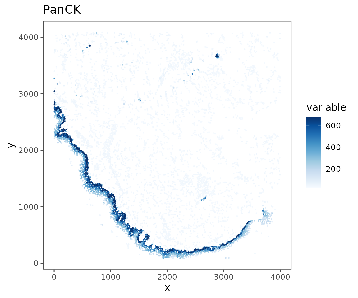
sm <- sm %>%
  Normalize(method = "asinh",
            from = "Data",
            to = "NormalizedData") %>%
  Normalize(method = "scale",
            from = "NormalizedData",
            to = "ScaledData") %>%
  Normalize(method = "scale",
            MARGIN = 2,
            from = "ScaledData",
            to = "ScaledData")
#> Normalizing data using method `asinh`
#>
#> Normalizing data using method `scale`
#>
#> Normalizing data using method `scale`
#>

plotRepresentation(sm[[1]],
                   representation = "spatial",
                   what = "PanCK",
                   data.slot = "ScaledData",
                   # Can specify a "trim" parameter for continuous variables
                   # to prevent outliers from washing out the color scale
                   trim = c(0.01, 0.95))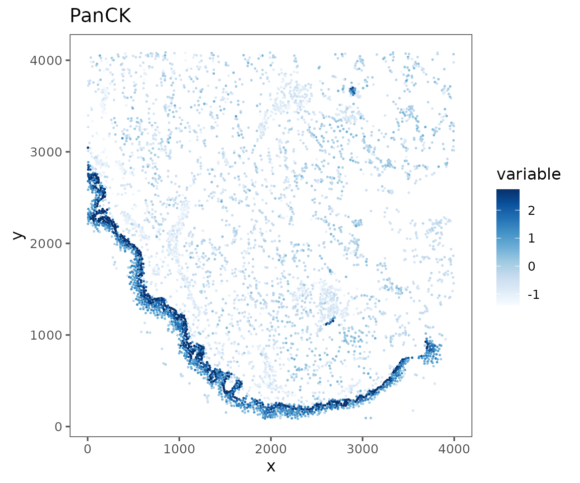
Any other spatial statistic you can calculate and add to the object’s cellMetadata can be visualized using plotRepresentation. For example, information theoretic entropy can provide an interesting metric of spatial heterogeneity of cell phenotypes. Higher entropy is more heterogeneous.
sm <- spatialNearestNeighbors(sm, method = "knn", k = 10) %>%
  localEntropy(nn = "spatial_knn_10",
               feature = "anno540_Phenotype4")

plotRepresentation(sm[[1]],
                   representation = "spatial",
                   what = "local_entropy.spatial_knn_10.anno540_Phenotype4")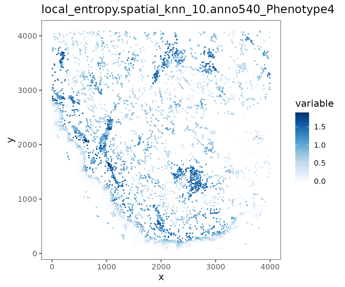
See the advanced spatial tutorial for more info on spatial statistics supported by
SpatialMap
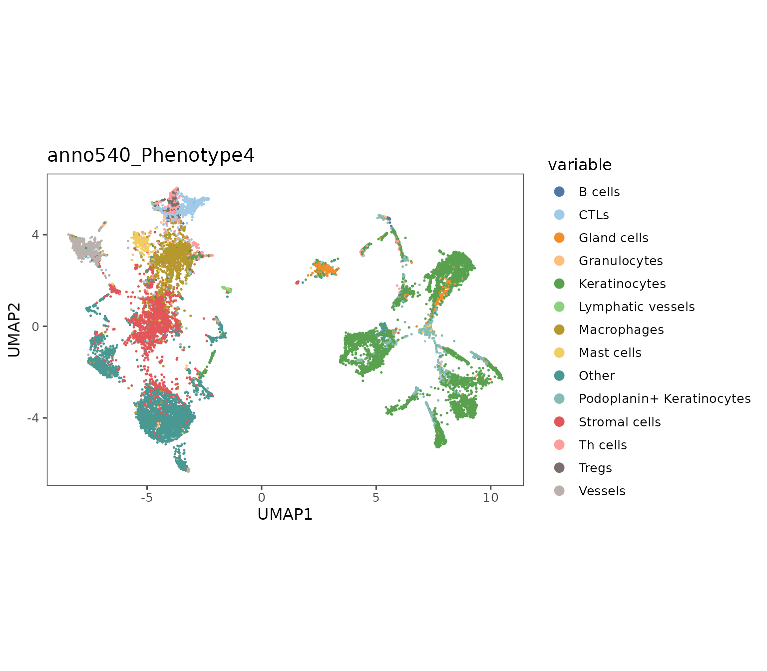
UMAP visualization
plotRepresentation can also be used to visualize dimensionality reductions of biomarker expression space e.g. UMAP embeddings.
For representations that include multiple regions (like the one below), the shuffle parameter can be useful to ensure that the ordering of the data in your dataframe isn’t driving visual artifacts. Without it, the last region in your object will be plotted on top which can create a misleading data presentation.
Additionally, the subsample parameter can be useful to reduce the density of data presented in the plot. You can specify a proportion that is used to randomly sample a subset of your cells for plotting.
# Generating a UMAP embedding.
set.seed(8534)
sm <- sm %>%
  createAnalysis(regions = Regions(sm)) %>%
  runUMAP(data.slot = "ScaledData",
          PCA = F,
          min_dist = 0.0001)
#> New analysis created.
#>  6 Regions
#>  25557 cells
#>  40 common features
#>
#> Added Analysis `combined` to SpatialMap project 'SpatialMap Project'.
#> Setting as active Analysis
#>
#>   By analysis: 'combined'
#>
#> Computing UMAP
#>
#> 16:08:26 UMAP embedding parameters a = 1.932 b = 0.7906
#> 16:08:26 Read 25557 rows and found 40 numeric columns
#> 16:08:26 Building Annoy index with metric = cosine, n_trees = 50
#> 0%   10   20   30   40   50   60   70   80   90   100%
#> [----|----|----|----|----|----|----|----|----|----|
#> **************************************************|
#> 16:08:31 Writing NN index file to temp file /tmp/RtmpqvIp3v/file11fe721e16b4
#> 16:08:31 Searching Annoy index using 2 threads, search_k = 3000
#> 16:08:42 Annoy recall = 100%
#> 16:08:43 Commencing smooth kNN distance calibration using 2 threads with target n_neighbors = 30
#> 16:08:44 Initializing from normalized Laplacian + noise (using irlba)
#> 16:08:45 Commencing optimization for 200 epochs, with 1102192 positive edges
#> 16:08:57 Optimization finished

plotRepresentation(sm,
                   representation = "umap",
                   what = "anno540_Phenotype4",
                   shuffle = TRUE)
#>   By analysis: 'combined'
#> 
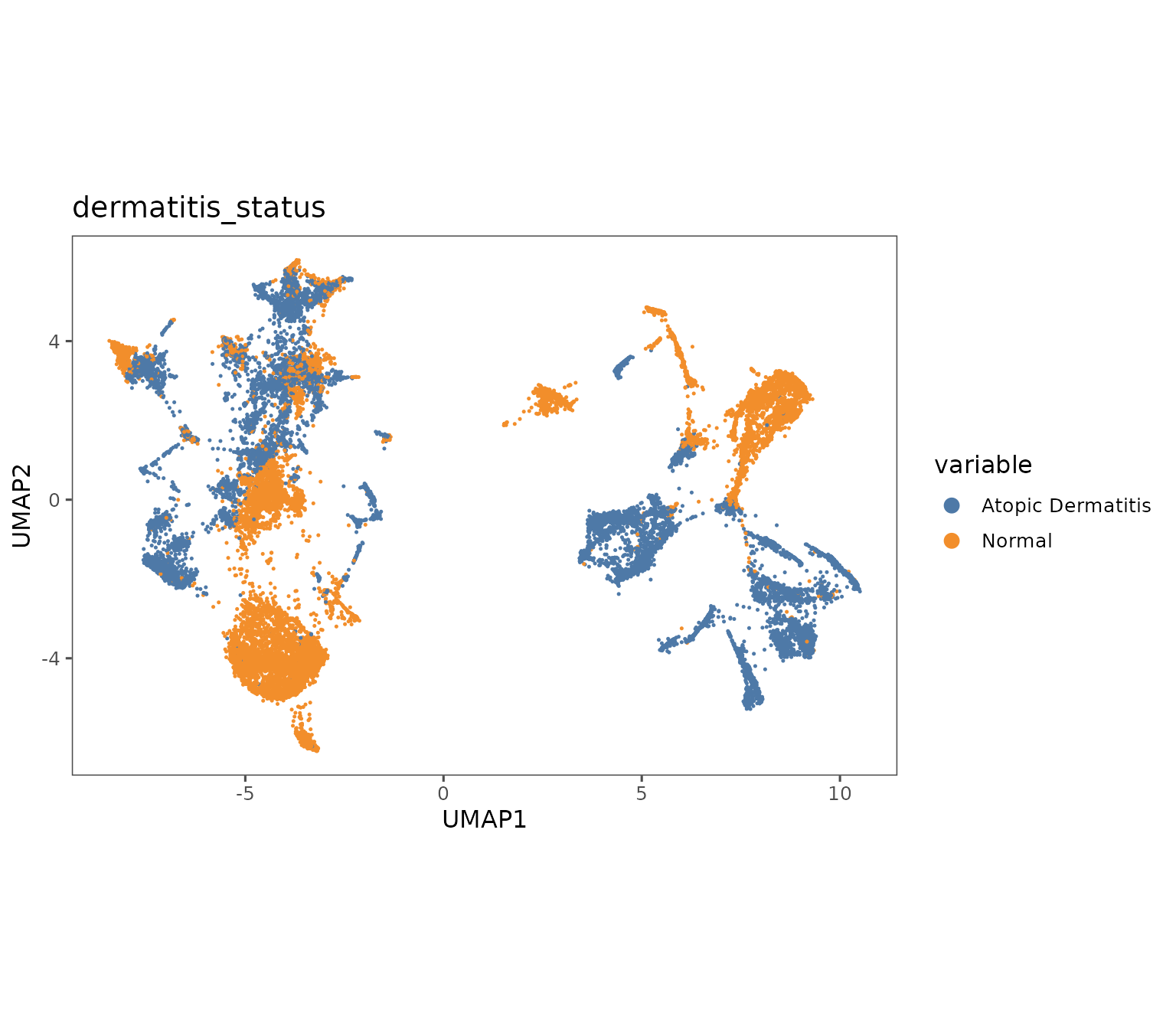
plotRepresentation(sm,
                   representation = "umap",
                   what = "dermatitis_status",
                   shuffle = TRUE)
#>   By analysis: 'combined'
#> 
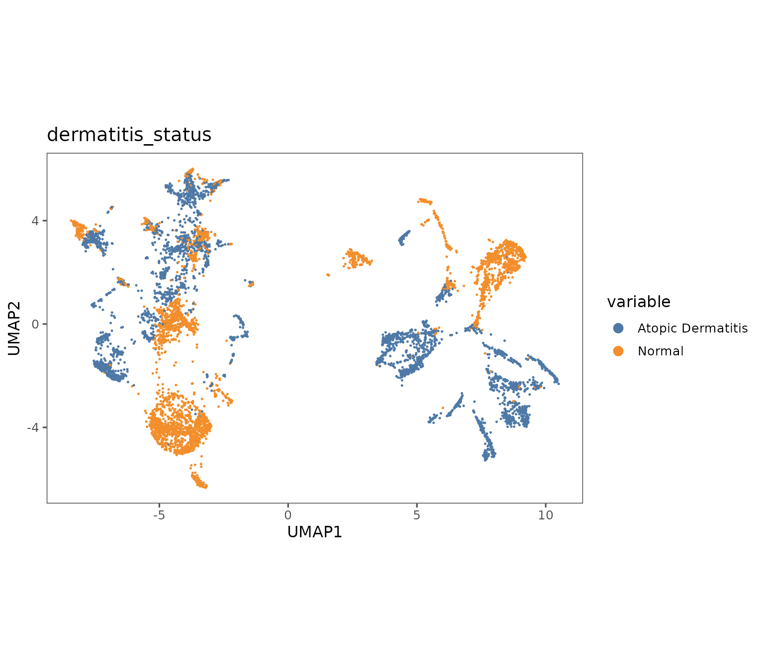
plotRepresentation(sm,
                   representation = "umap",
                   what = "dermatitis_status",
                   shuffle = TRUE,
                   subsample = 0.3)
#>   By analysis: 'combined'
#> 
plotImage
This function pulls raw image data from the Portal and displays it.
Since our demo dataset up to now doesn’t have a direct connection to data on the Portal, we will pull a small dataset from the database to demonstrate plotImage. This is a condensed version of the data pull that’s demonstrated in analysis guide 1.
STUDY_NAME <- "Immune cell topography predicts response to PD-1 blockade in cutaneous T cell lymphoma"
region_table <- get_study_metadata(study_names = STUDY_NAME)
example_region <- "07-002.Pre_1"
region_table <- dplyr::filter(region_table,
                              region_display_label %in% example_region)

sm_image <- suppressMessages(spatialmap_from_db(acquisition_ids = region_table$acquisition_id,
                                                study_names = STUDY_NAME,
                                                neutral.markers = c("DAPI", "Blank"),
                                                annotation_types = "none"))
Most basic, you can pull the image for a single biomarker. Here, we’re showing the biomarker expression profiles derived from the image to show how they correspond to each other.
plotImage(sm_image,
          markers = "CD3",
          text_size = 10,
          scalebar = 100) # In microns
#> $`CITN10Co-88_c001_v001_r001_reg001`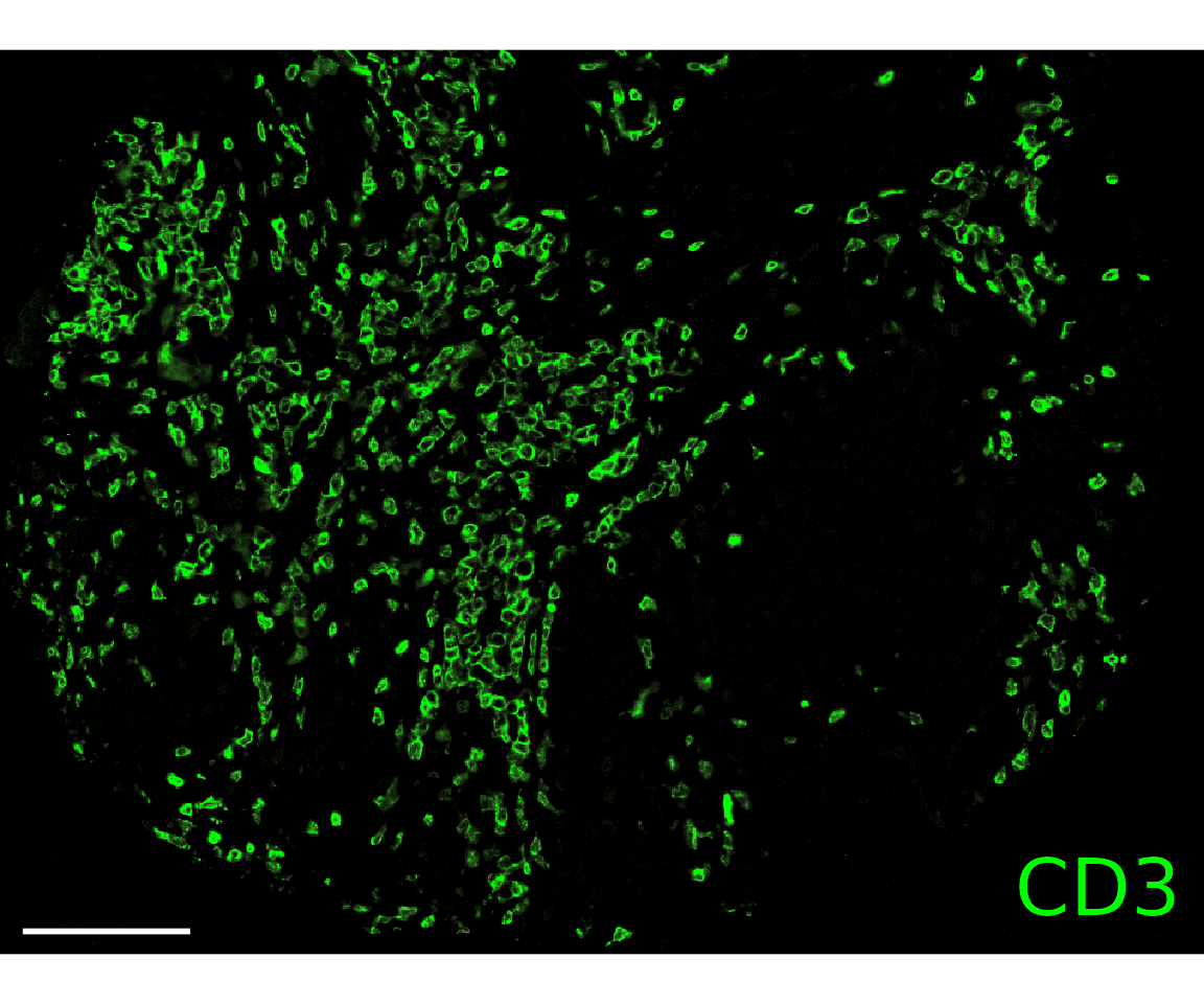
# Normalizing CD3 biomarker expression for better visualization
sm_image <- suppressWarnings(Normalize(sm_image, method = "asinh"))
#> Normalizing data using method `asinh`
#>

plotRepresentation(sm_image, "spatial", "CD3", data.slot = "NormalizedData")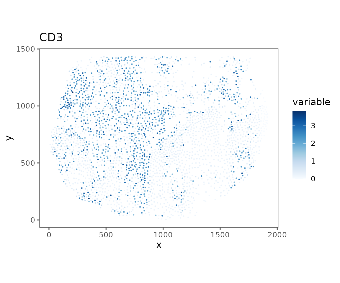
Note: This function returns a
ggplotobject by default, which allows some customization but can also be very memory intensive. To save time, you can setgg.output = FALSE, which will make this function return a raster image object
You can also pull multiple channels at once. The function will automatically choose colors, or you can specify colors. You can also zoom in or out, or specify an area to pull (useful in conjunction with emconnect::get_stories to pull specific ROIs!).
plotImage(sm_image,
          markers = c("PanCK", "CD8", "CD4", "CD31"),
          text_size = 5,
          scalebar = 100)
#> $`CITN10Co-88_c001_v001_r001_reg001`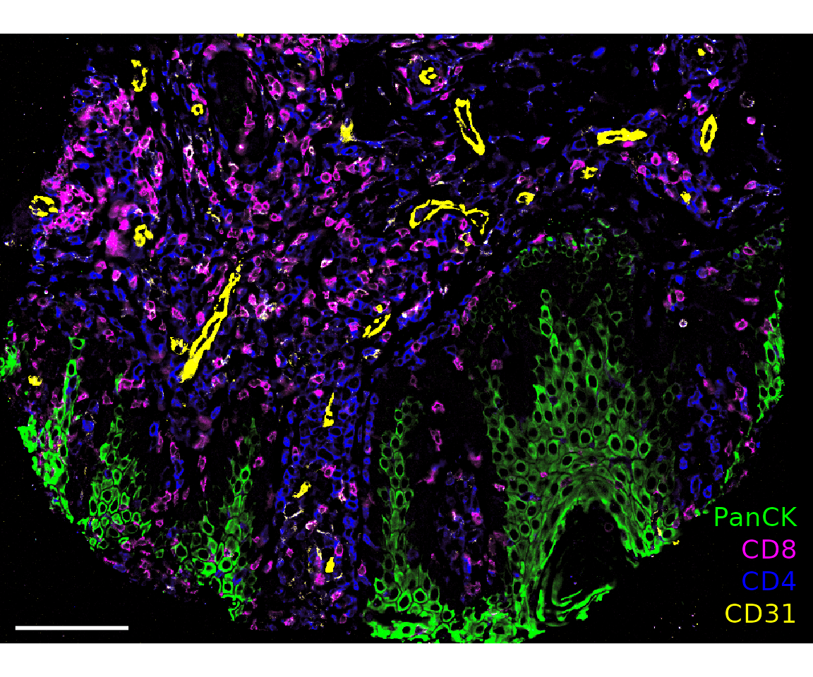
plotImage(sm_image,
          markers = c("PanCK", "CD8", "CD4", "CD31"),
          text_size = 5,
          colors = c("Green", "Blue", "Cyan", "Red"),
          scalebar = 100)
#> $`CITN10Co-88_c001_v001_r001_reg001`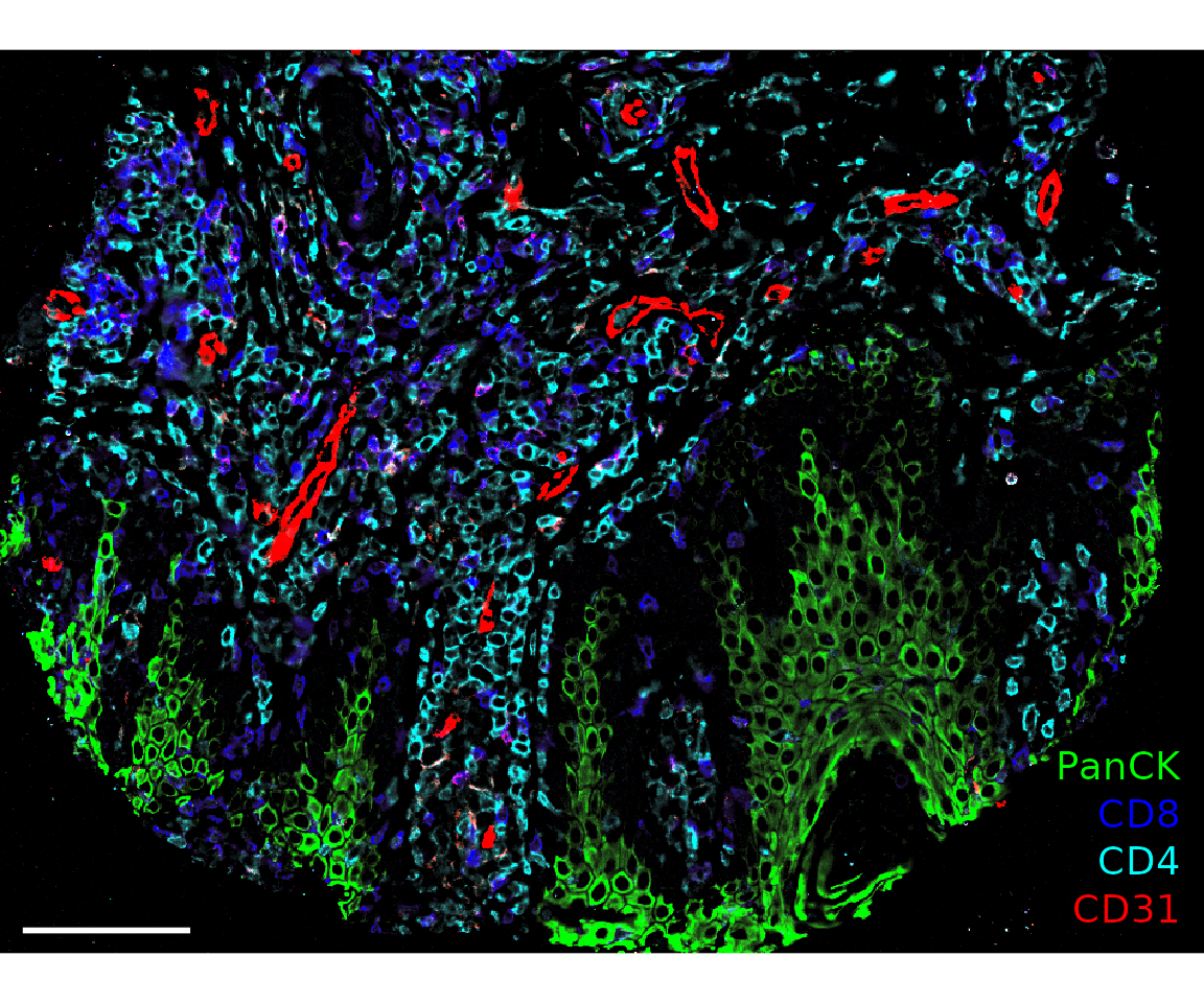
plotImage(sm_image,
          markers = c("PanCK", "CD8", "CD4", "CD31"),
          text_size = 5,
          colors = c("Green", "Blue", "Cyan", "Red"),
          window = list(c(250, 750), c(400, 1000)),
          scalebar = 50)
#> $`CITN10Co-88_c001_v001_r001_reg001`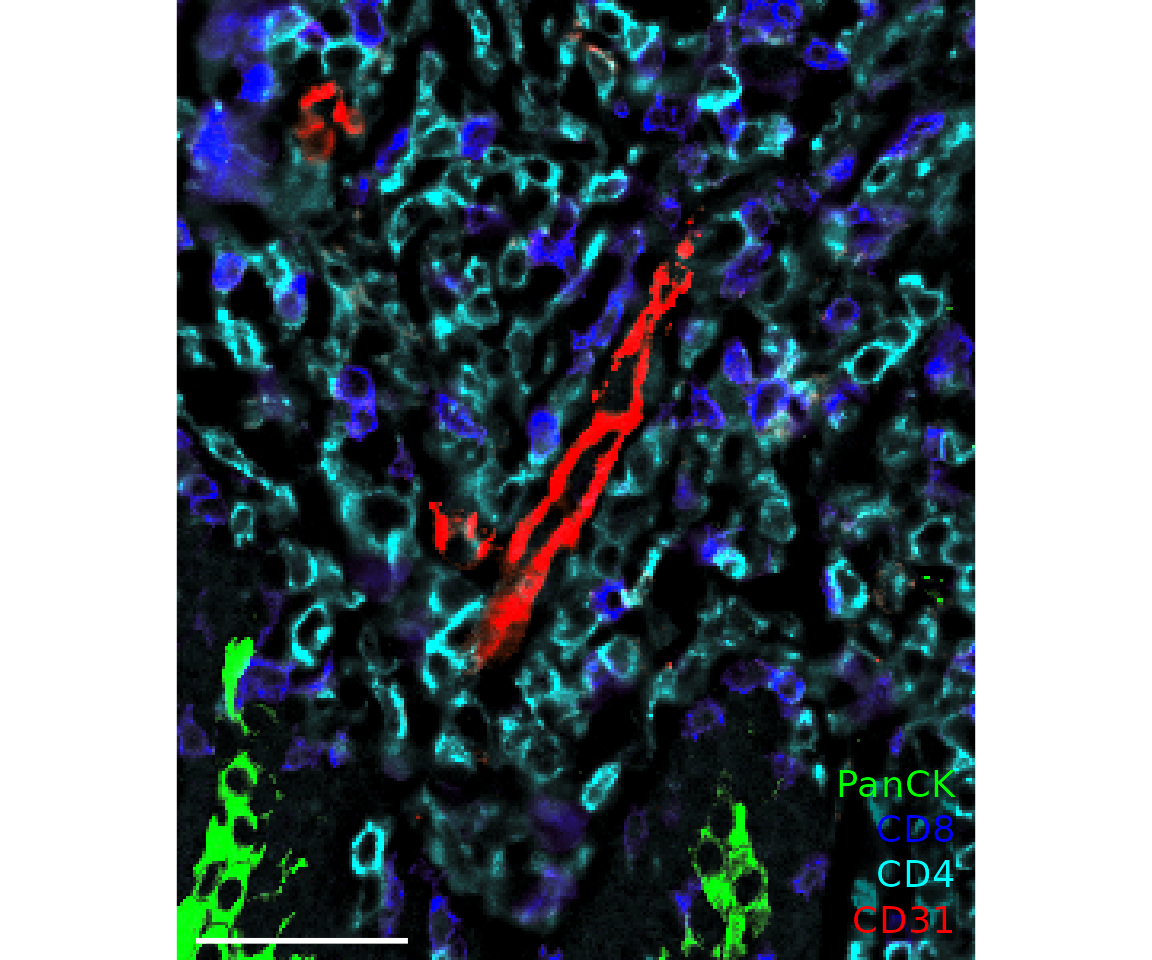
Quality control
SpatialMap has a few functions that are useful for visualizing the results from the cell-level QC process run by the package. This is described in more detail in the quality control analysis guide vignette.
Starting by calculating QC variables for plotting.
new.settings <- c(
  min_signal.cv = 1,
  max_signal.cv = 3.5,
  max_DNA = 20000,
  min_DNA = 250,
  min_signal.sum = 1500,
  max_signal.sum = 90000
)
settings(sm, names(new.settings)) <- new.settings

sm <- sm %>%
  QCMetrics() %>%
  FilterCodex()
#> Calculating quality control metrics...
#>
#>   By analysis: 'combined'
#>
#> Filtering cells...
#>
#>   By analysis: 'combined'
#>
#>   By analysis: 'combined'
#>
plotQCSummary
This function generates a plot for each of the QC metrics calculated for the SpatialMap object (or just the ones specified to the argument qc.metrics). By default, this will draw one density curve per experiment, based on the grouping variable "experiment_label" from the object’s projectMetadata slot.
plotQCSummary(sm)
#> [[1]]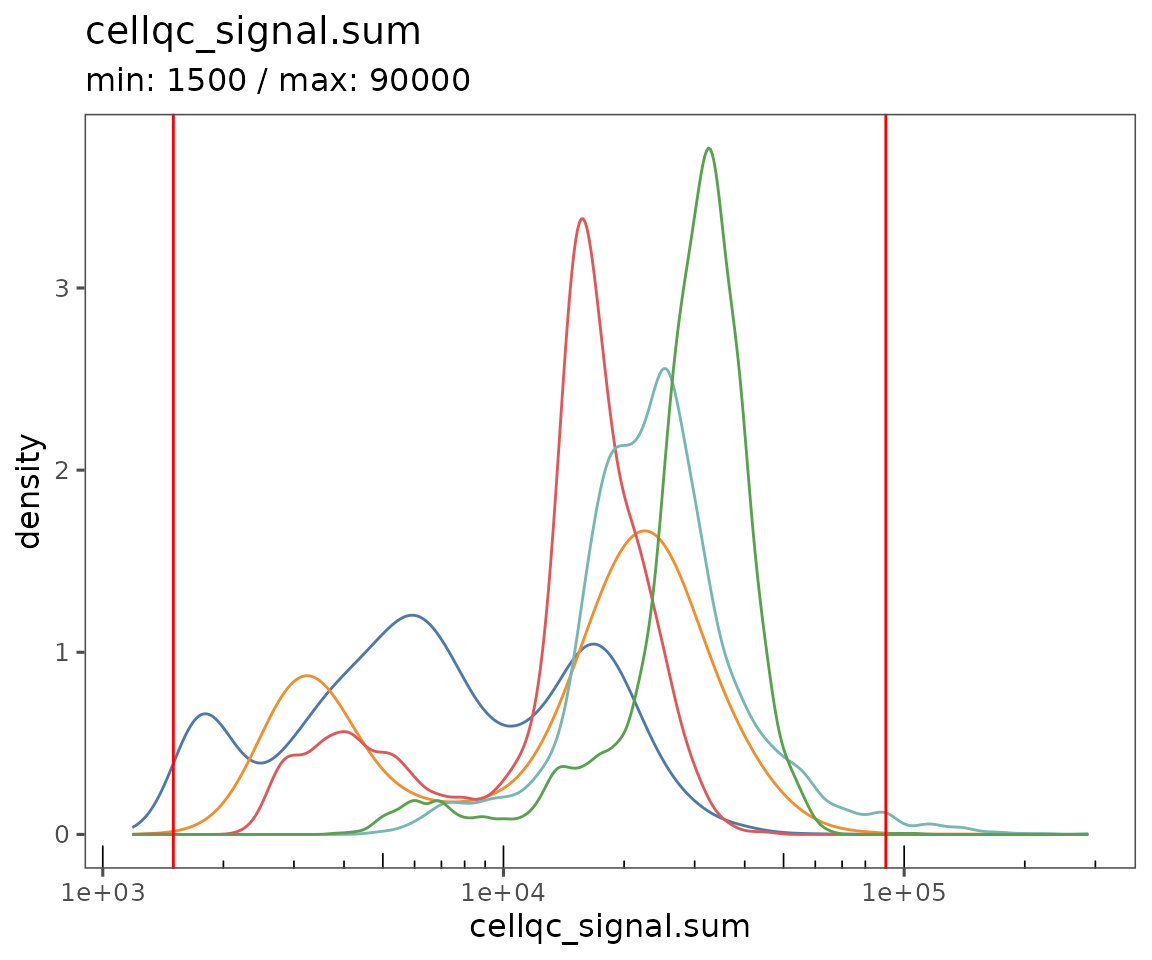
#>
#> [[2]]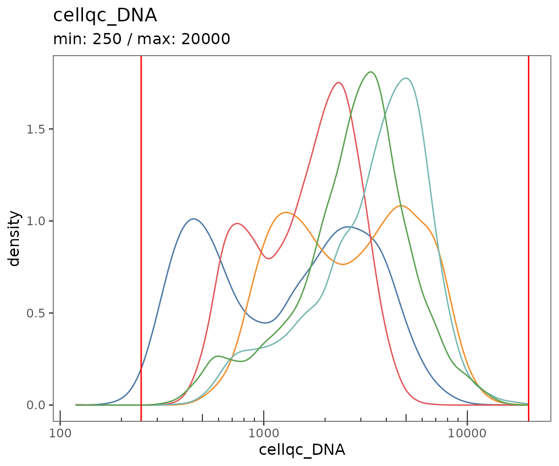
#>
#> [[3]]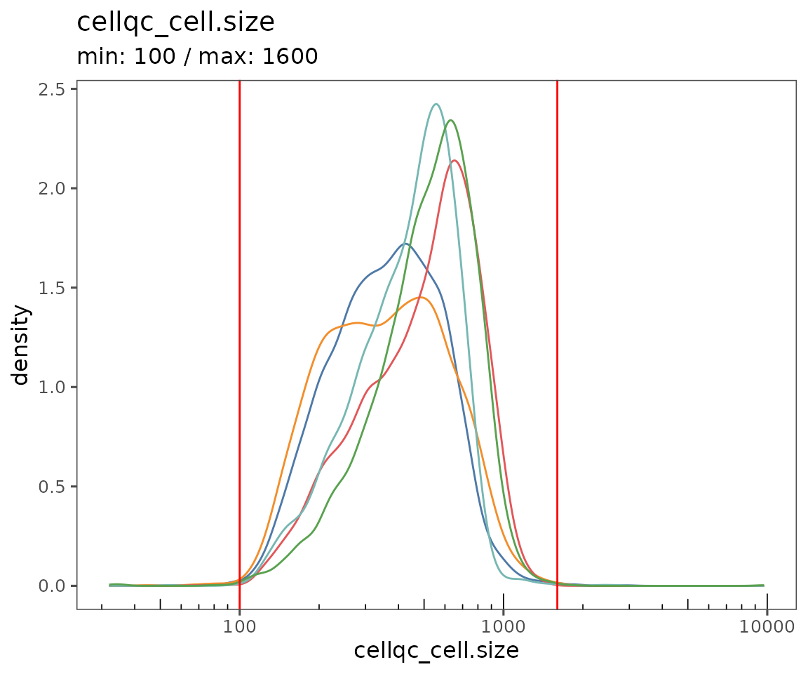
#>
#> [[4]]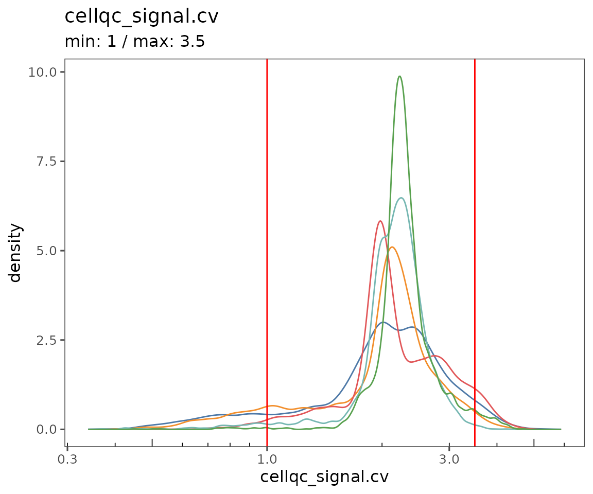
To see a separate curve for each region, try setting Region (for acquisition ID) or region_display_label (for the label you’ll see more frequently on the Portal).
plotQCSummary(sm, group.variable = "region_display_label")
#> [[1]]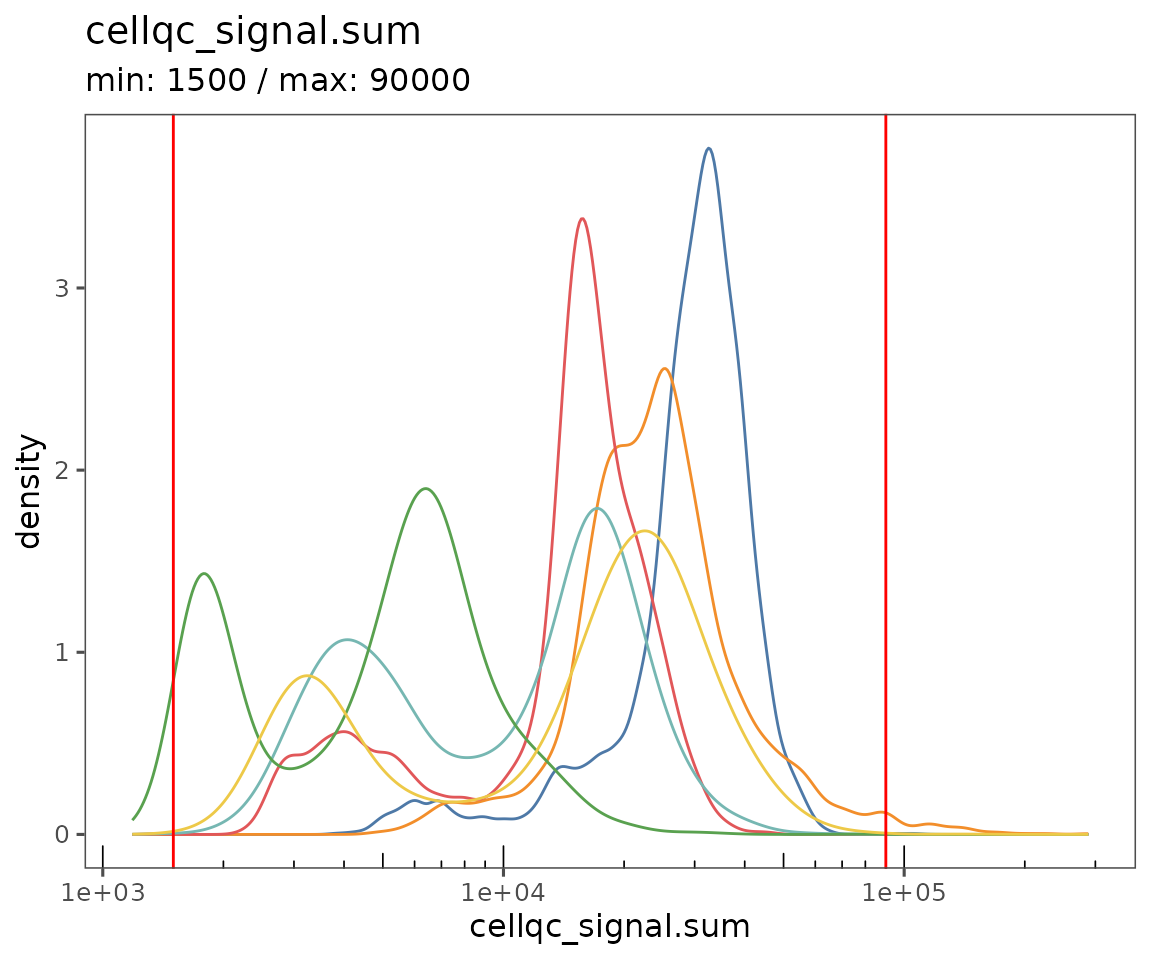
#>
#> [[2]]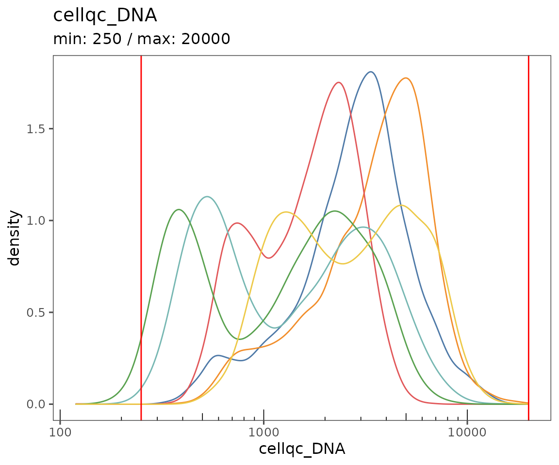
#>
#> [[3]]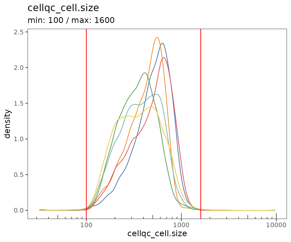
#>
#> [[4]]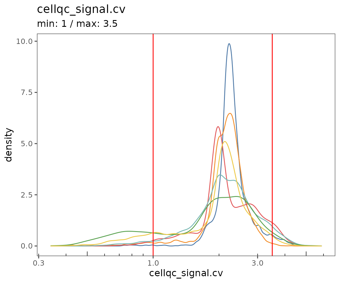
plotFilterSummary
This function generates three plots:
Shows the QC filtering results summarized across
group.variable. The colors indicate the fraction of cells that failed due to being outside the thresholds for each of the QC filtering parameters. Specifyregion_display_labelto see the results for each region.Shows the results summarized for the entire
SpatialMapobject. Also, includes the color key for both 1 & 2, showing which parameters or combinations of parameters are indicated by which colors. Any categories with fewer than 50 cells total will be lumped as “other”.Shows a scatter plot, demonstrating the relationship between cell count and the number of cells in each of the groups specified by
group.variable. Often, smaller regions have a larger fraction of failing cells.
plotFilterSummary(sm, group.variable = "region_display_label")
#> [[1]]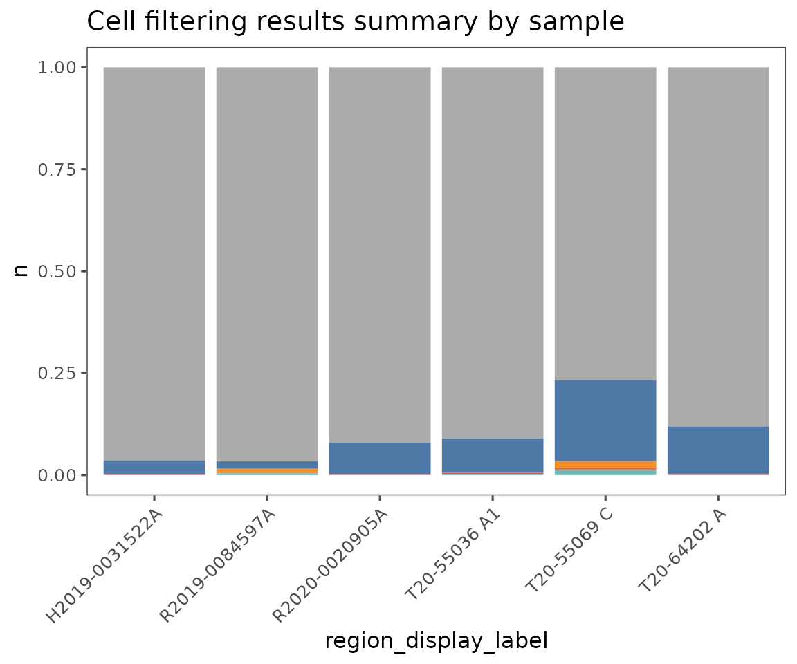
#>
#> [[2]]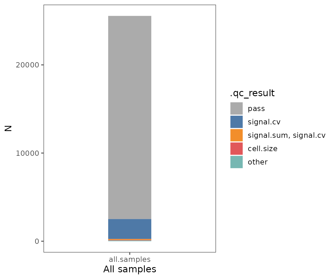
#>
#> [[3]]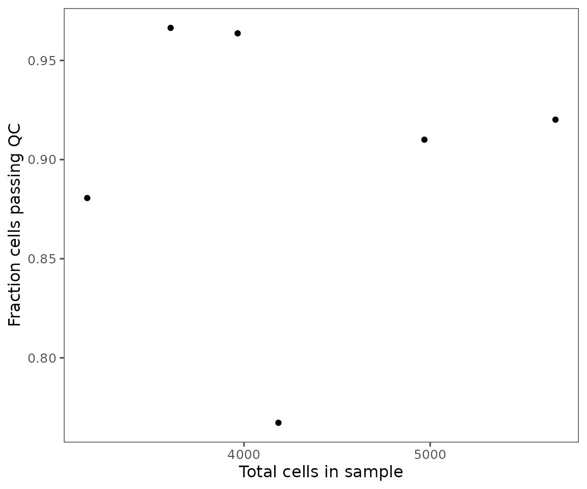
plotFilteredCells
Shows the spatial distribution of cells colored by their QC results.
plotFilteredCells(sm)
#> $Skin1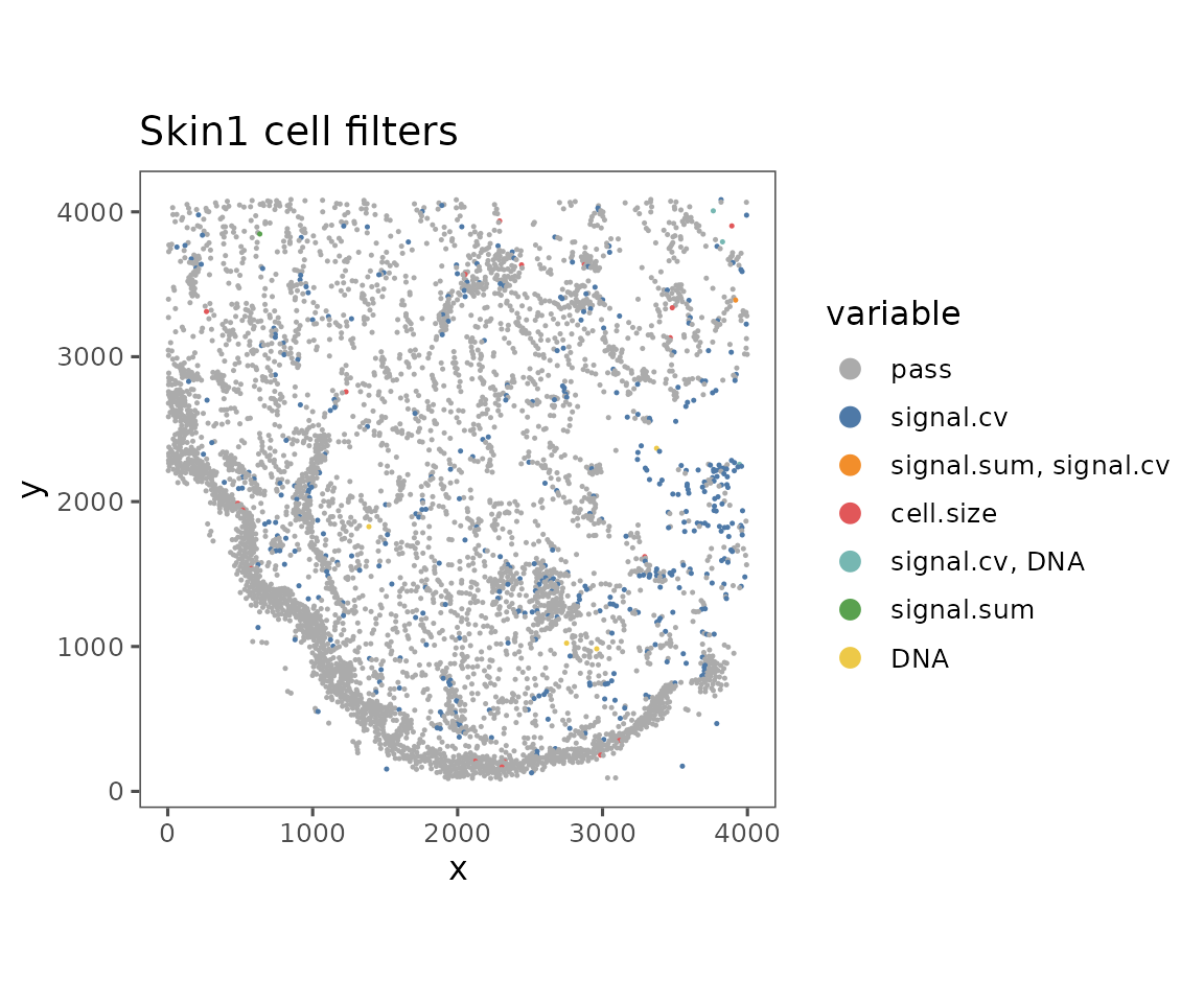
#>
#> $Skin2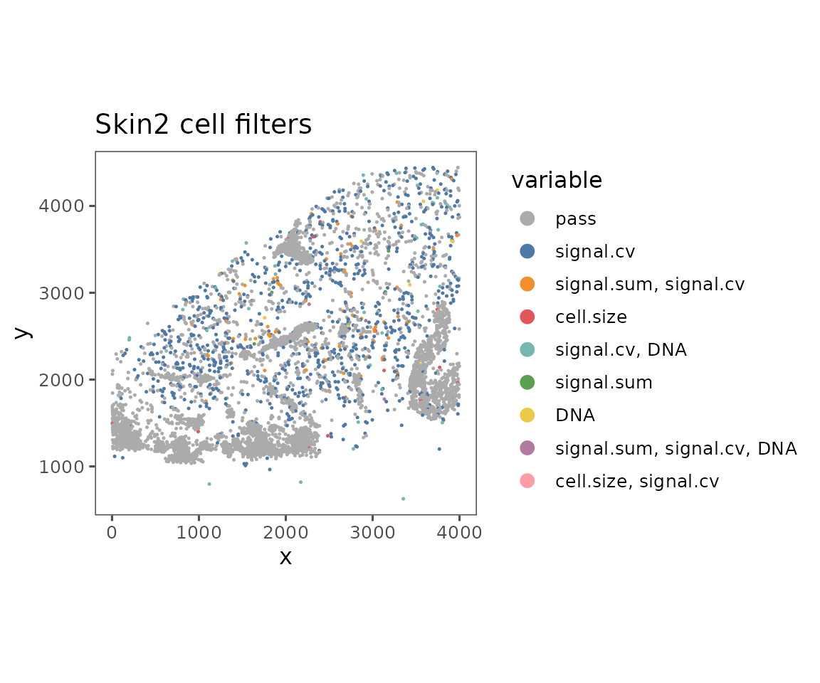
#>
#> $Skin3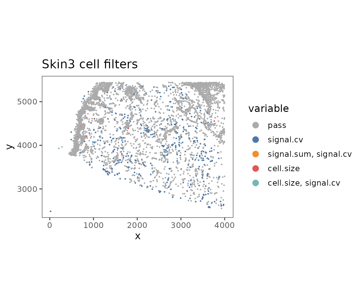
#>
#> $Skin4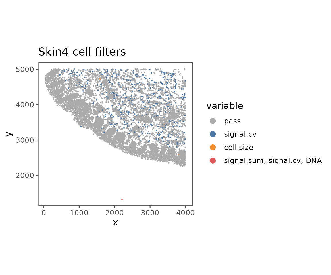
#>
#> $Skin5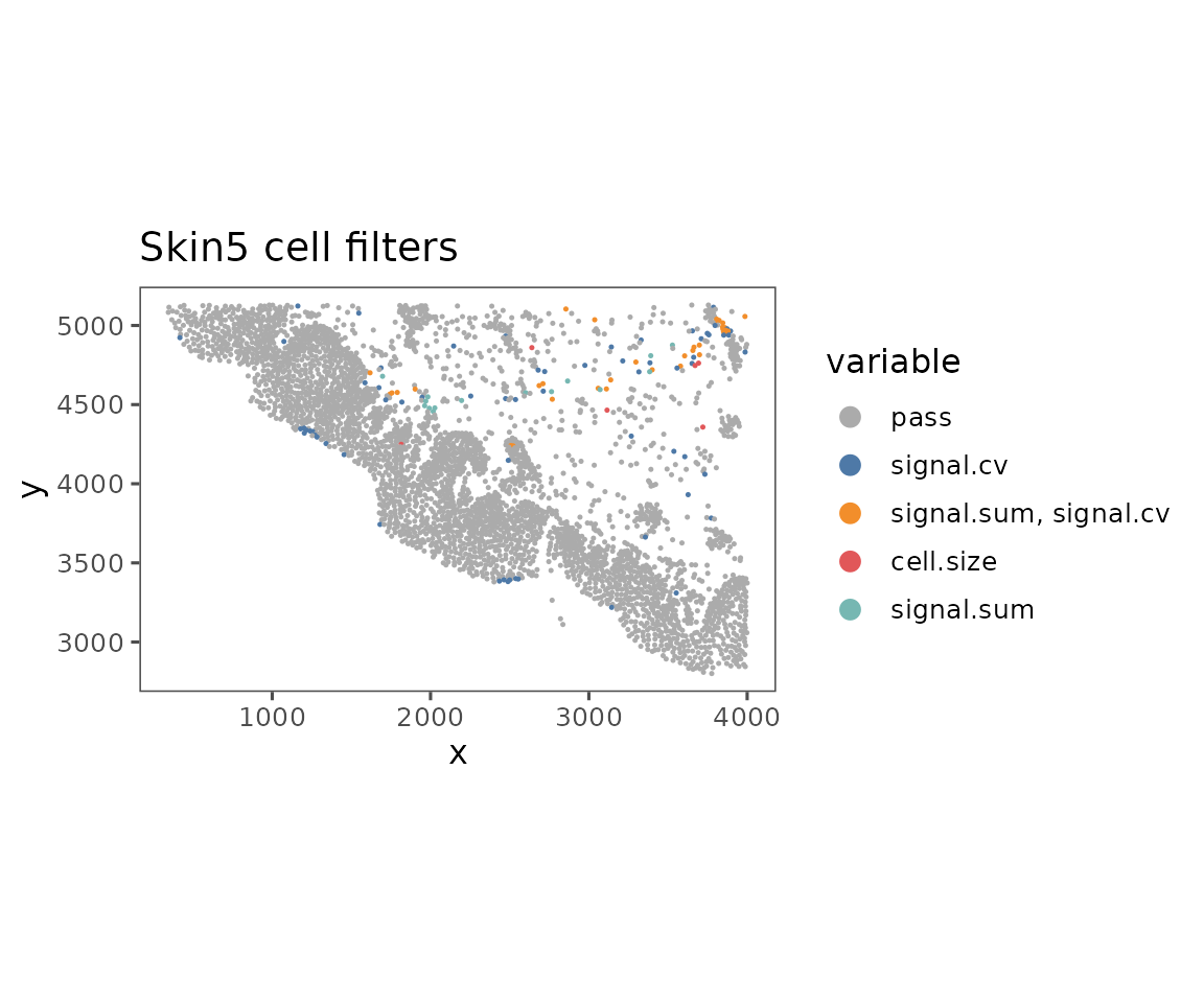
#>
#> $Skin6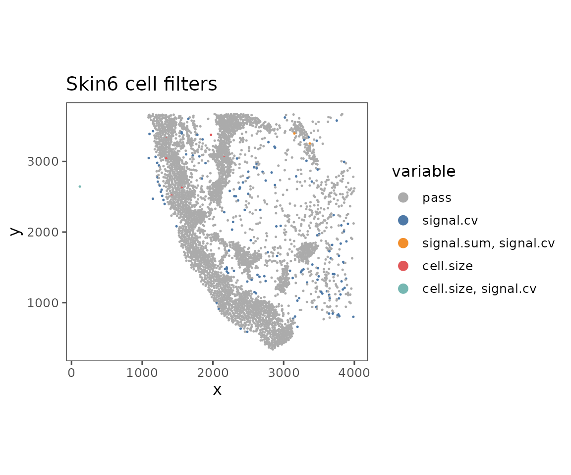
plotExpressionHeatmap
Useful to compare the biomarker expression profiles of different cell phenotypes. A key component of the clustering workflow described in analysis guides 3 and 4.
Typically for this visualization, we recommend performing normalization and scaling on the data first. Additional scaling can be applied on the heatmap values, but is not usually necessary.
hm <- plotExpressionHeatmap(sm,
                            data.slot = "ScaledData",
                            summary.fun = "median",
                            summarize.across = "anno540_Phenotype4",
                            scaling = "none",
                            # Using padding to prevent text from being cut off.
                            bottom_pad = 1)
#> Plotting expression from slot 'ScaledData'.
#> Scaling = 'none'
#>   By analysis: 'combined'
#>

hm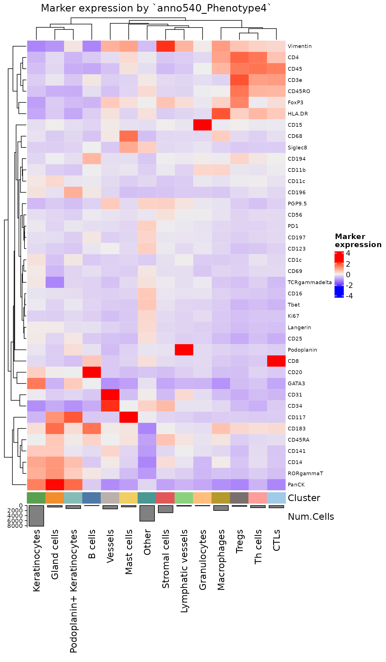
NOTE: This is one of the few functions in this vignette that does not return a
ggplotobject. Instead it uses the plotting libraryComplexHeatmap, which is more optimized for creating heatmap visualizations. While changing aggplotobject’s layout is easy to do after creation, most layout changes inComplexHeatmapobjects must be performed in the call that creates them. See?ComplexHeatmap::Heatmapfor a full list of formatting arguments that can be passed through.
plotCellProportions
Helpful for comparing cell frequencies across units of analysis. The default visualization is a stacked bar graph, showing the proportions of each of the cell types.
plotCellProportions(sm,
                    var1 = "region_display_label",
                    var2 = "anno540_Phenotype4") +
  ggplot2::coord_flip() # Default puts var1 on the x-axis, but visualization is sometimes clearer with it on y-axis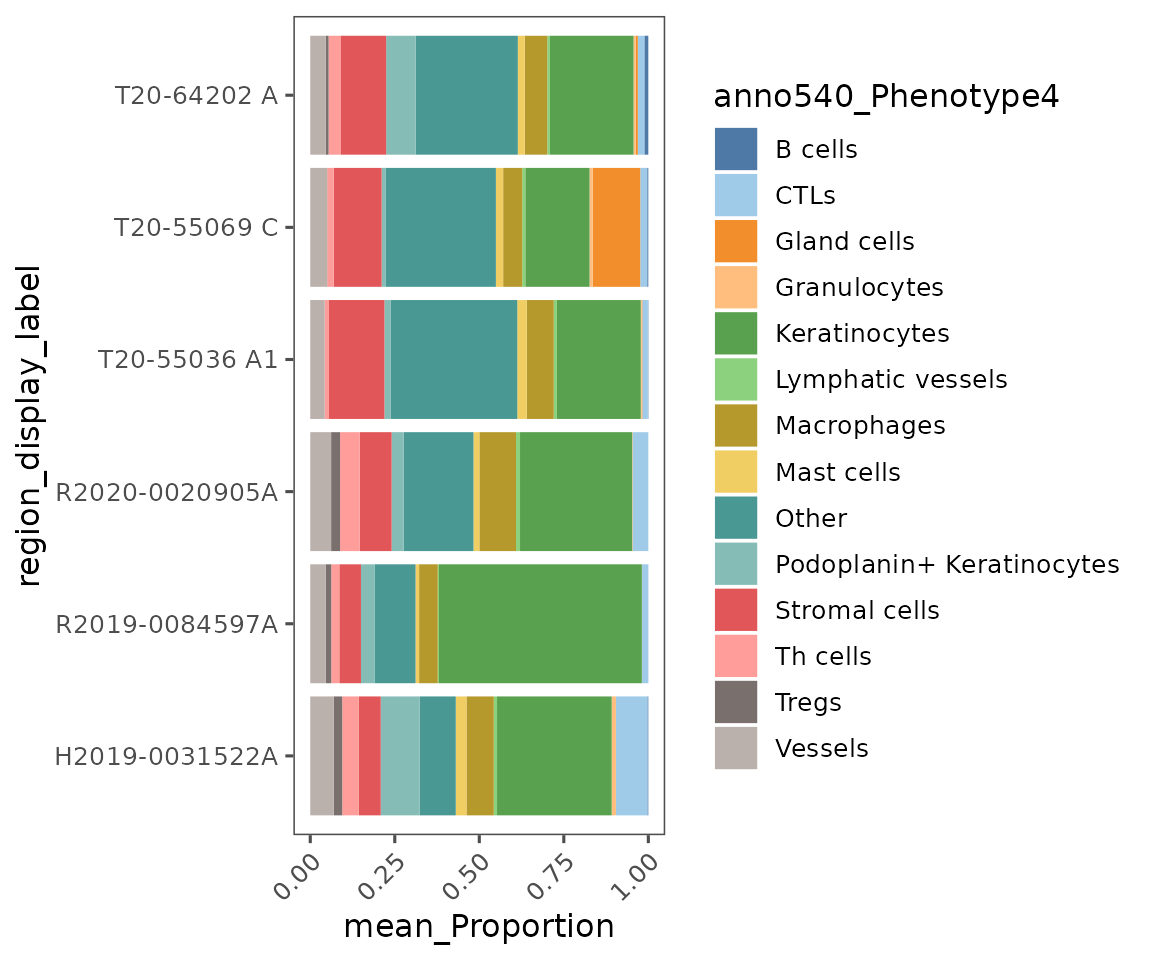
Note the usage of
ggplot2::coord_flipin the previous code chunk. Since this is aggplotobject, we can useggplotfunctions and syntax to modify it. This function switches the x- and y-axes.
You can also use this function to create box plots, or a number of other plot types described in ?plotCellProportions.
plotCellProportions(sm,
                    var1 = "anno540_Phenotype4",
                    var2 = "dermatitis_status",
                    type = "box",
                    select_var1 = c("CTLs",
                                    "Gland cells",
                                    "Stromal cells",
                                    "Th cells"))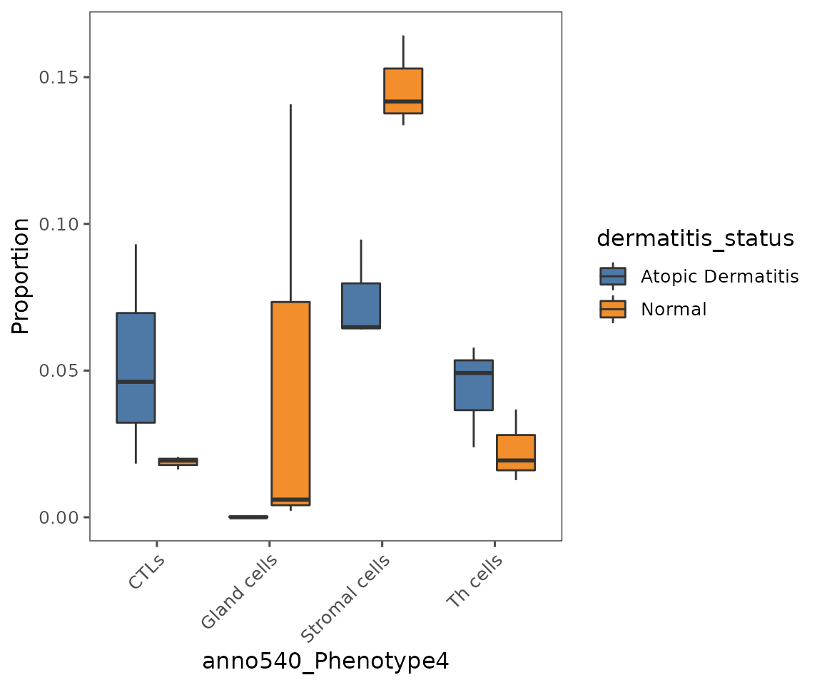
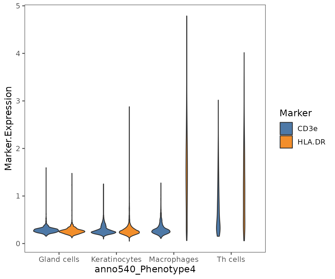
plotViolins
A very useful method for comparing biomarker expression values across cell phenotypes.
Note: while it is possible to use this to compare biomarker expression values across different imaged areas, we would generally caution against this for immunofluorescence data (e.g. Phenocycler data produced by Enable’s lab). These methods are inherently less quantitative across different imaged areas, due to differences in tissue preparation. We would typically recommend binning expression using a gating based approach, and then comparing frequencies of cells that are biomarker positive vs. negative rather than comparing absolute expression values.
plotViolins(sm,
            what = c("HLA.DR", "CD3e"),
            group.by = "anno540_Phenotype4",
            subset = c("Keratinocytes",
                       "Gland cells",
                       "Th cells",
                       "Macrophages"),
            color.pal = ggthemes::tableau_color_pal("Tableau 10")(3))
#>   By analysis: 'combined'
#> 
plotCohortsVolcano
Create a volcano plot comparing the frequency of a trait in cellMetadata across cohorts defined in projectMetadata.
Unlike most of these plotting functions, takes a data.frame as input. Designed to work with the output of the function compareCohorts.
cohort_result <- compareCohorts(sm,
                                feature = "anno540_Phenotype4",
                                cohort_colname = "dermatitis_status")

plotCohortsVolcano(cohort_result)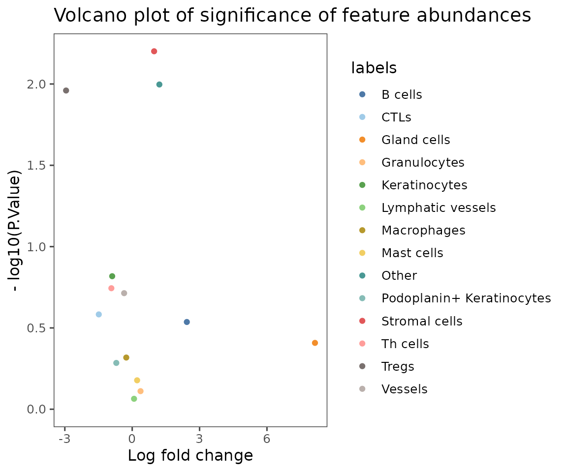
Spatial analyses
These next few plots are focused on showing the results of the pairwise adjacency and neighborhood analyses supported in SpatialMap.
To set up for them, we will run a condensed version of the analyses run in analysis guide 5 (cell interactions) and analysis guide 6 (neighborhood analysis).
activeAnalysis(sm) <- "regions"

sm <- pairwiseAdjacency(
  sm,
  method = "hypergeometric",
  feature = "anno540_Phenotype4",
  nn = "spatial_knn_10"
)

sm <- cellNeighborhoods(
  sm,
  nn = "spatial_knn_10",
  feature = "anno540_Phenotype4"
)

set.seed(95986)

sm <- neighborhoodClusters(sm,
                           nn = "spatial_knn_10",
                           feature = "anno540_Phenotype4")
Note that, while not a plotting function,
neighborhoodClustersdoes create a plot as a side effect if the argumentkisn’t specified. This plot shows the results of silhouette score calculation to determine the optimal number of neighborhoods. See?neighborhoodClustersfor more details.
plotPairwiseAdjacency
This function generates a list of heatmaps representing the pairwise adjacency of each cell type for each region.
NOTE: If you’ve performed sample-level aggregation analysis with
pairwiseAdjacency, then you will need to specify the sameanalyzeparameter toplotPairwiseAdjacency. See?pairwiseAdjacencyfor more details.
pa_plots <- plotPairwiseAdjacency(sm,
                                  nn = "spatial_knn_10",
                                  feature = "anno540_Phenotype4",
                                  bottom_pad = 1,
                                  left_pad = 1,
                                  top_pad = 0.5,
                                  right_pad = 1.5)

pa_plots[[1]]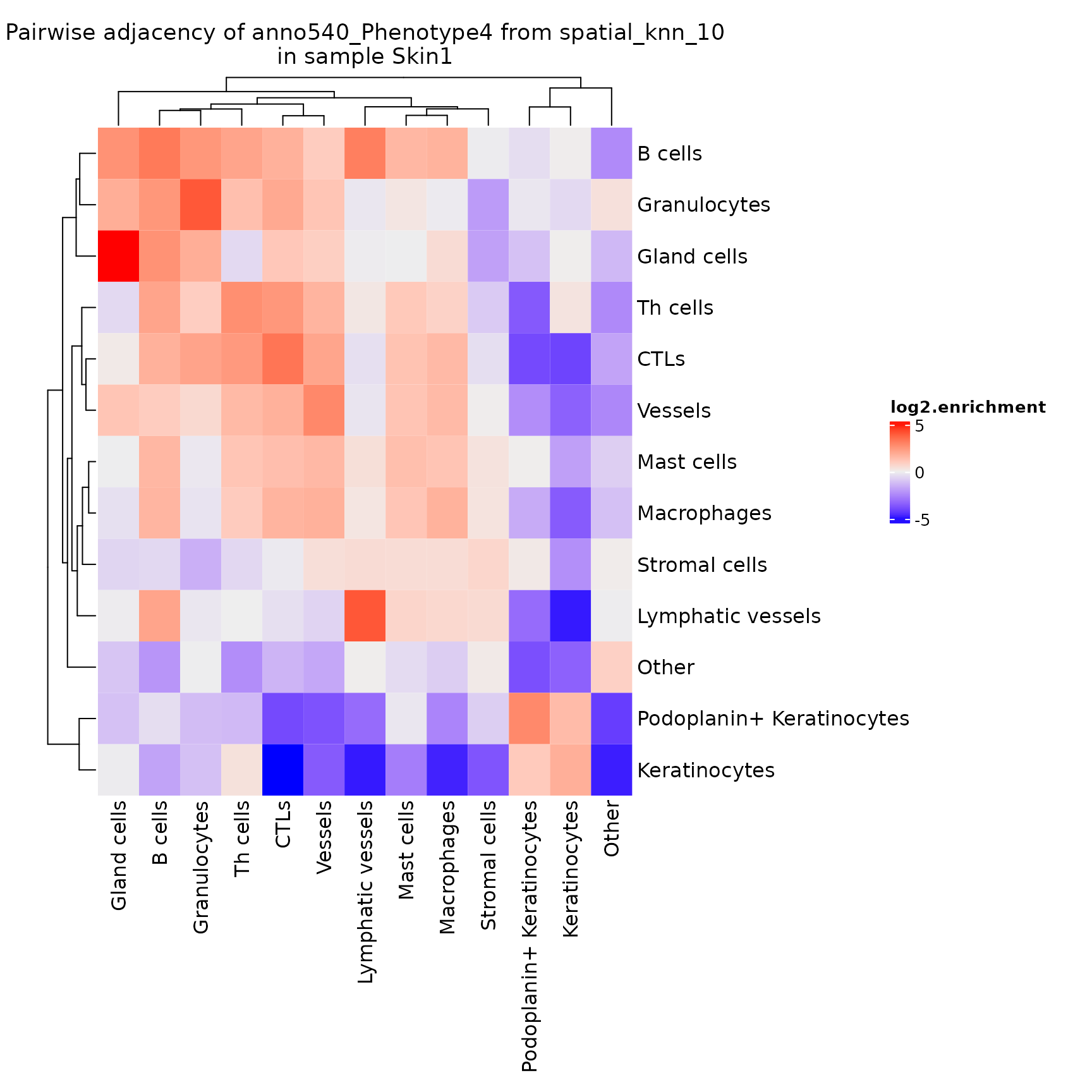
pa_plots[[2]]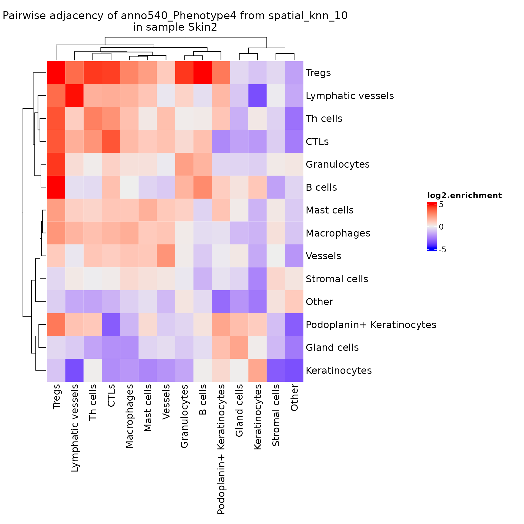
Note that this adjacency matrix won’t necessarily be symmetrical, depending on the method used to calculate the
nnnetwork!knnis inherently asymmetrical. Also note that this is another function that returns aComplexHeatmaprather than aggplotobject.
By default this plots the log2.enrichment of each interaction, but you can also direct it to plot the p.value.enrichment, p.value.depletion or a number of other variables as described in ?plotPairwiseAdjacency.
plotChordDiagram
Helps visualize the frequency of cell-cell interactions (based on pairwise adjacency) across regions or analyses. Creates chord diagrams in which each cell type (feature) is represented by a segment of the circle, with the size of the segment proportional to the frequency of that cell type. These segments are connected by ribbons, each of which represents a pairwise interaction between the two cell types, where the thickness of the ribbon corresponds to the number of interactions observed.
NOTE: If you’ve performed sample-level aggregation analysis with
pairwiseAdjacency, then you will need to specify the sameanalyzeparameter toplotChordDiagram. See?pairwiseAdjacencyfor more details.
chord_diags <- plotChordDiagram(sm,
                                nn = "spatial_knn_10",
                                feature = "anno540_Phenotype4")

chord_diags[[1]]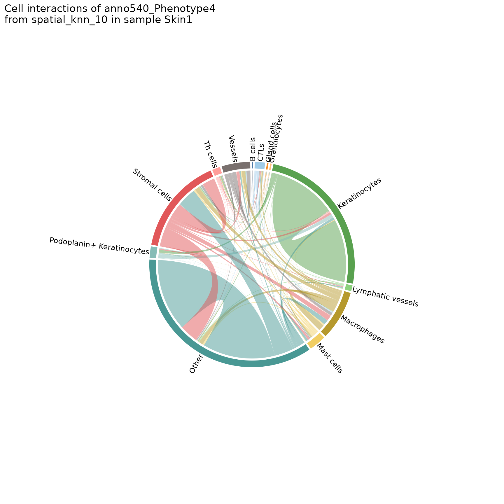
chord_diags[[2]]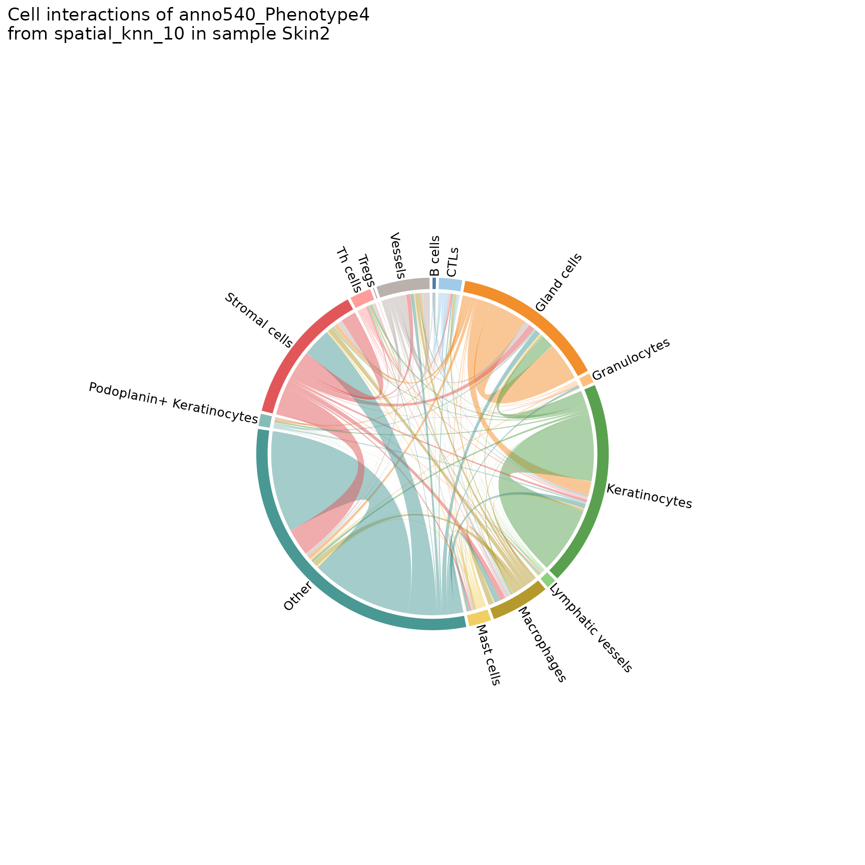
You can also make chord diagrams that aggregate interaction counts by specified groupings, namely the group.1 and group.2 parameters. See ?plotChordDiagram for more details.
# specify regions to be grouped
plotChordDiagram(sm,
                 nn = "spatial_knn_10",
                 feature = "anno540_Phenotype4",
                 group.1 = c("Skin1", "Skin2", "Skin3"),
                 group.2 = c("Skin4", "Skin5", "Skin6"))
#> $group1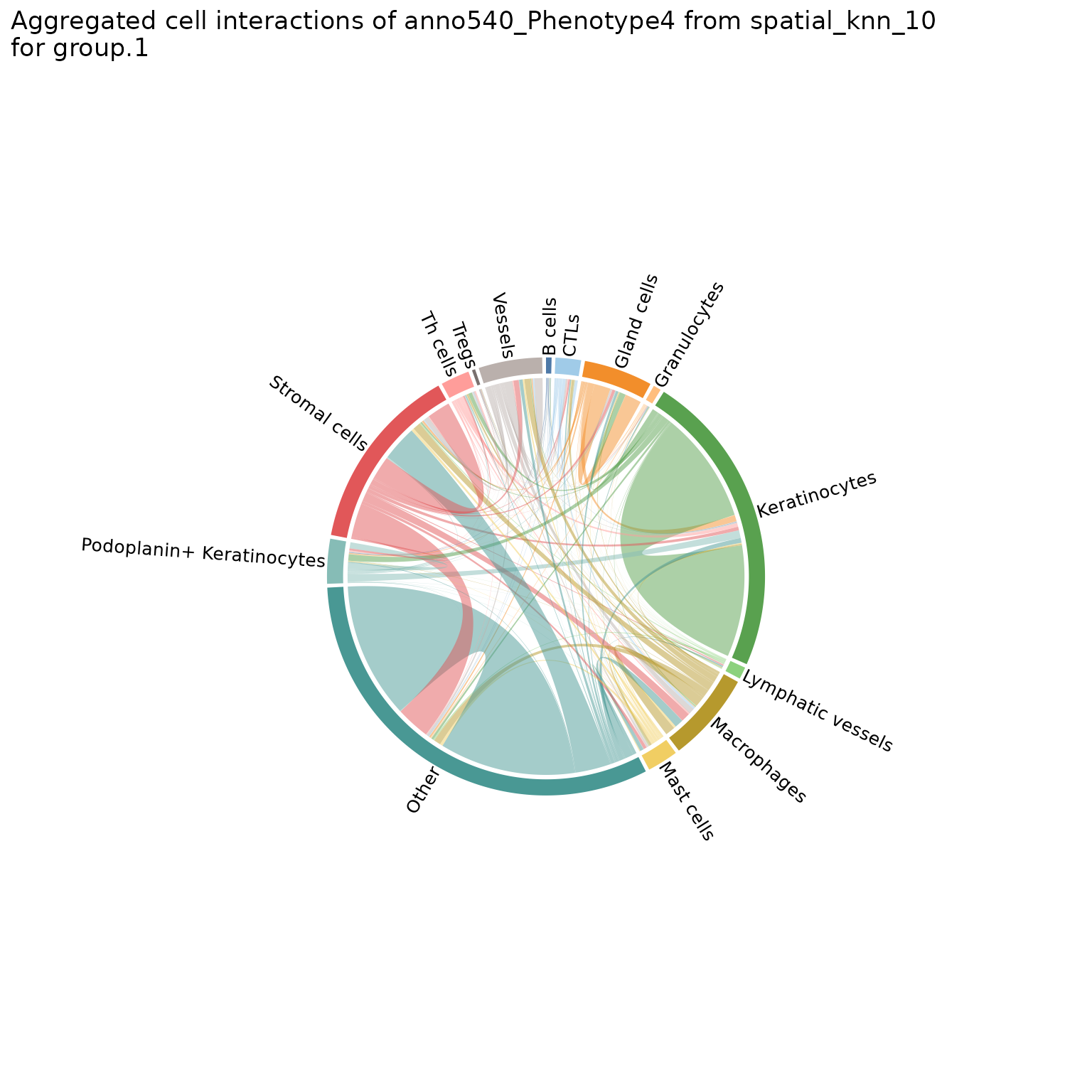
#>
#> $group2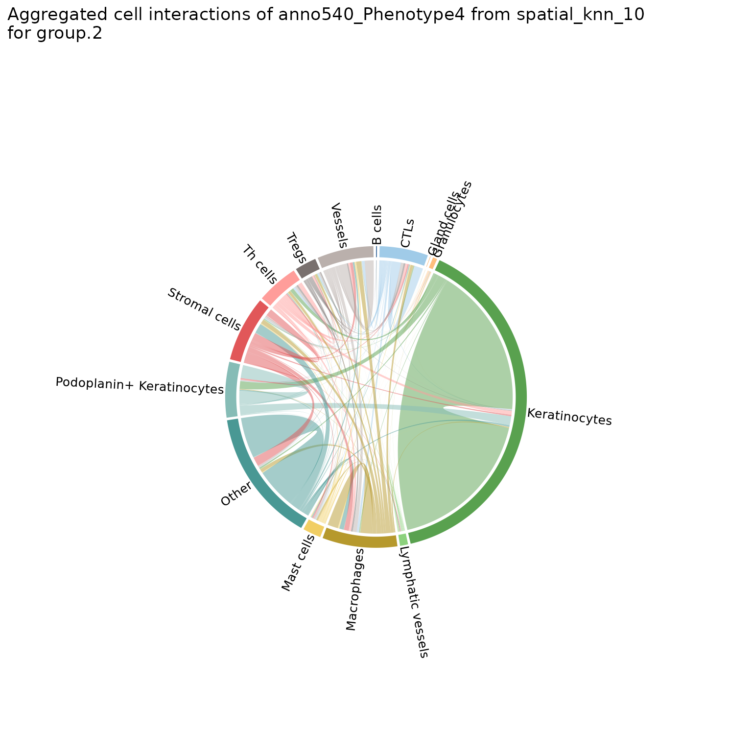
# specify a metadata property for sample groupings
chord_diags_derm <- plotChordDiagram(sm,
                                     nn = "spatial_knn_10",
                                     feature = "anno540_Phenotype4",
                                     group.1 = "dermatitis_status")
chord_diags_derm[["Atopic Dermatitis"]]
#> $group1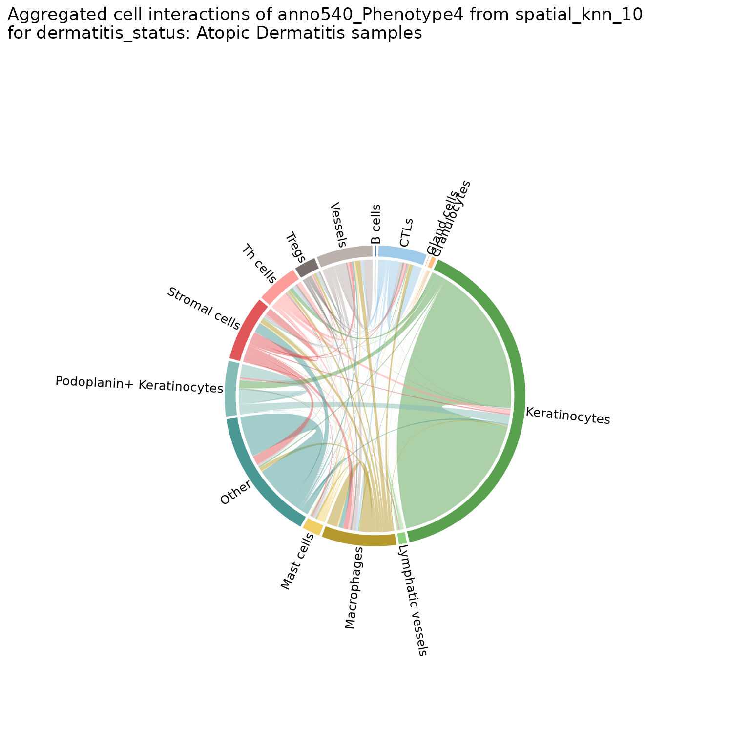
#>
#> $group2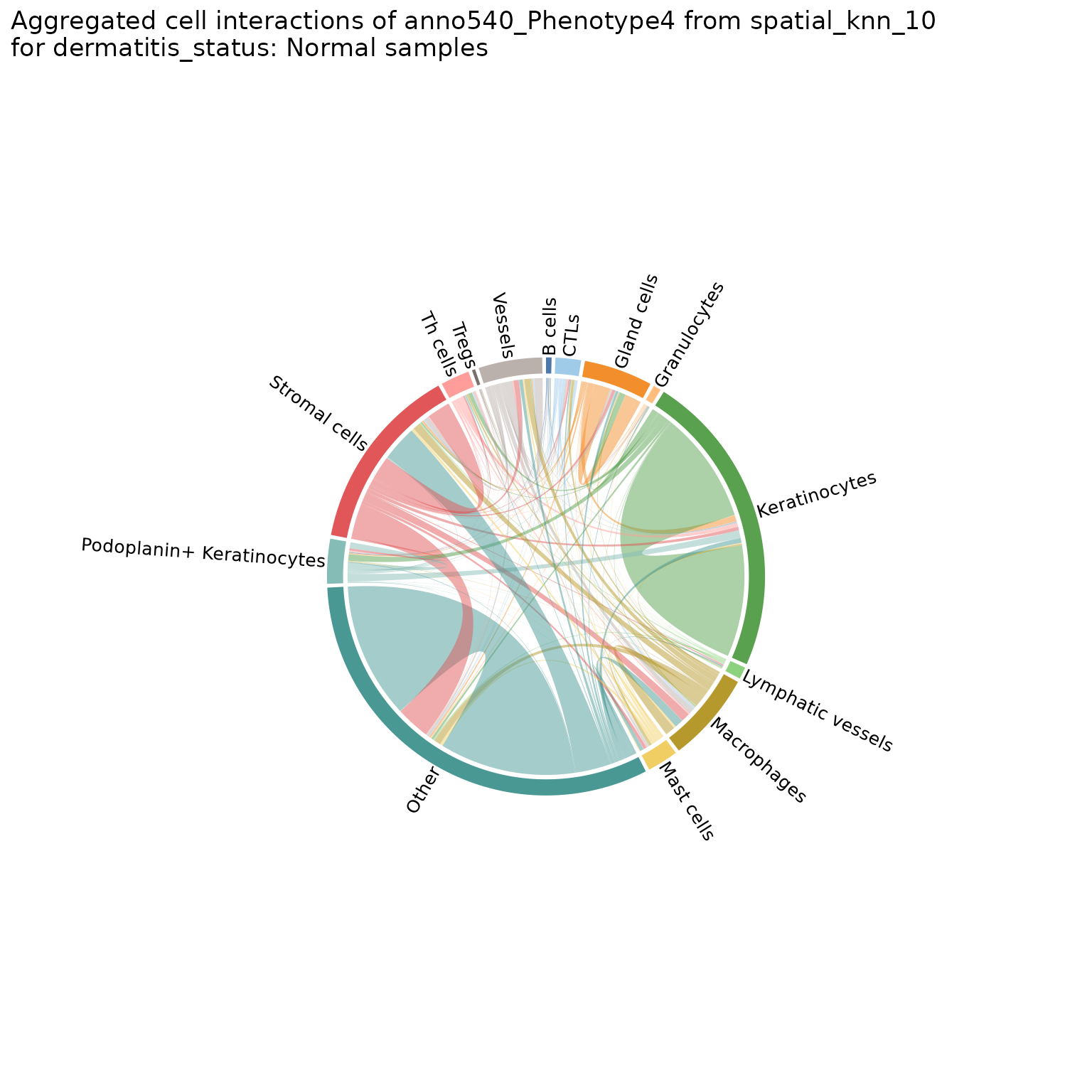
neighborhoodHeatmap
Helps characterize neighborhoods after they’ve been computed by showing the frequency of each cell type in each neighborhood. By default, creates a heatmap showing the neighbors of each cell grouped by neighborhood.
neighborhoodHeatmap(sm,
                    nn = "spatial_knn_10",
                    feature = "anno540_Phenotype4",
                    subsample = 2000,
                    bottom_pad = 1.5,
                    right_pad = 1)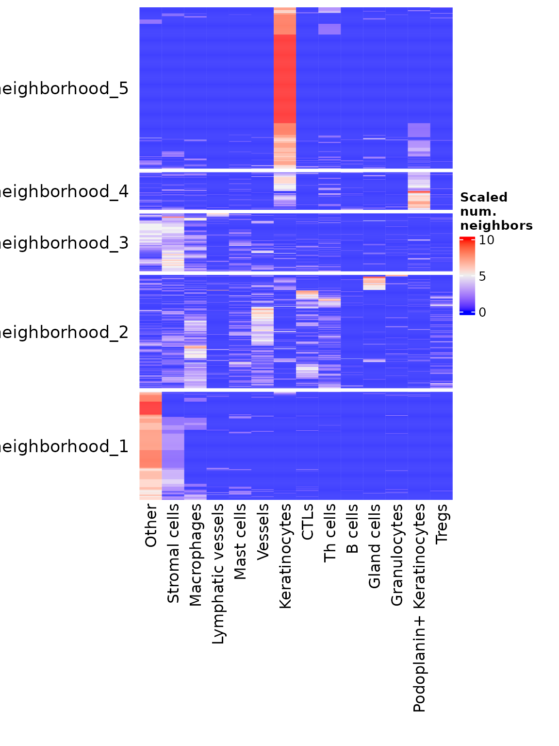
The
subsampleparameter samples down to the specified number of cells for this visualization. This function can be very slow for larger datasets if subsampling is omitted
You can also specify summarize = TRUE to get the average neighbor composition of the cells in each neighborhood.
neighborhoodHeatmap(sm,
                    nn = "spatial_knn_10",
                    feature = "anno540_Phenotype4",
                    summarize = TRUE,
                    row_names_side = "left",
                    bottom_pad = 1.2)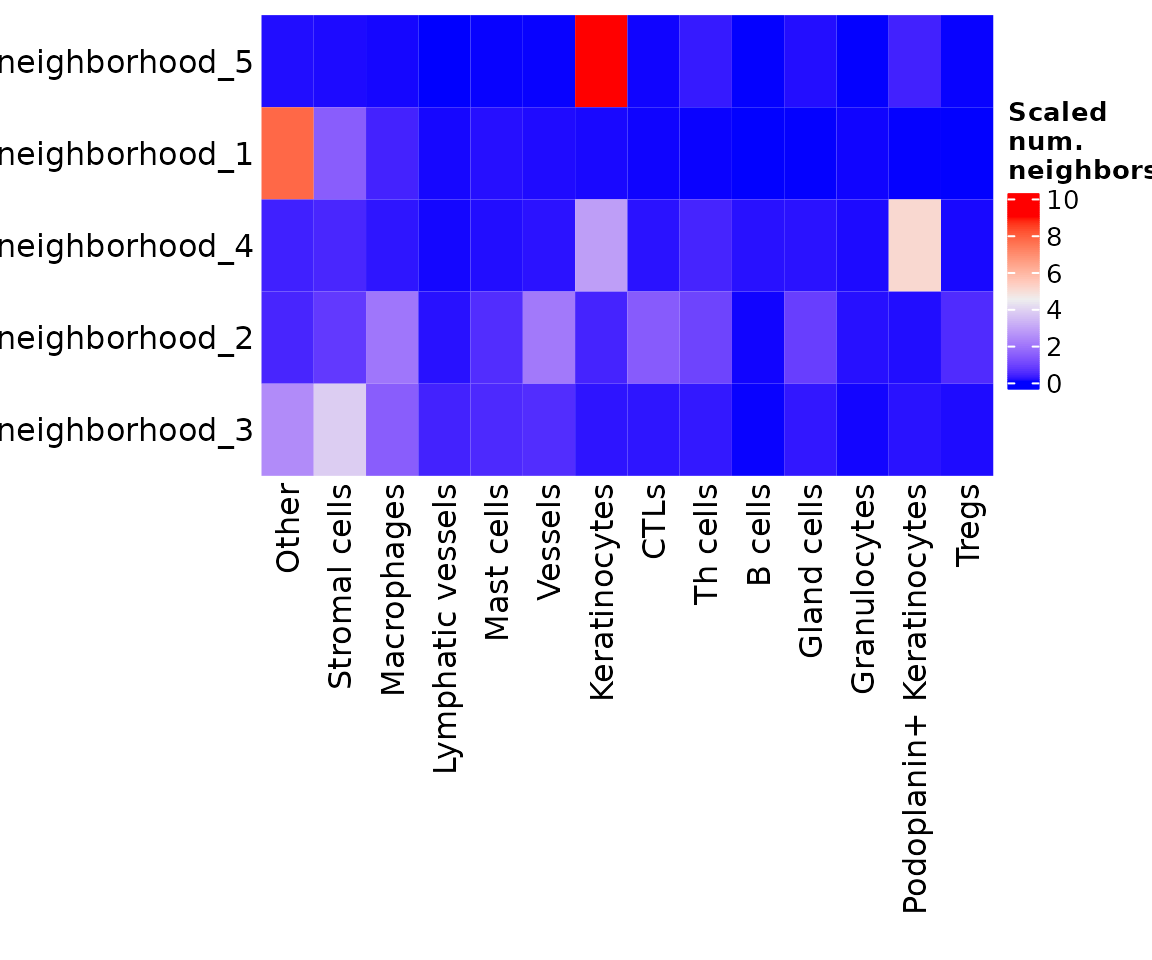
Note: this is another function that returns a
ComplexHeatmaprather than aggplotobject.
plotNeighborhoodCellCounts
Create violin plots showing the cell composition of each neighborhood.
plotNeighborhoodCellCounts(sm,
                           nn = "spatial_knn_10",
                           feature = "anno540_Phenotype4")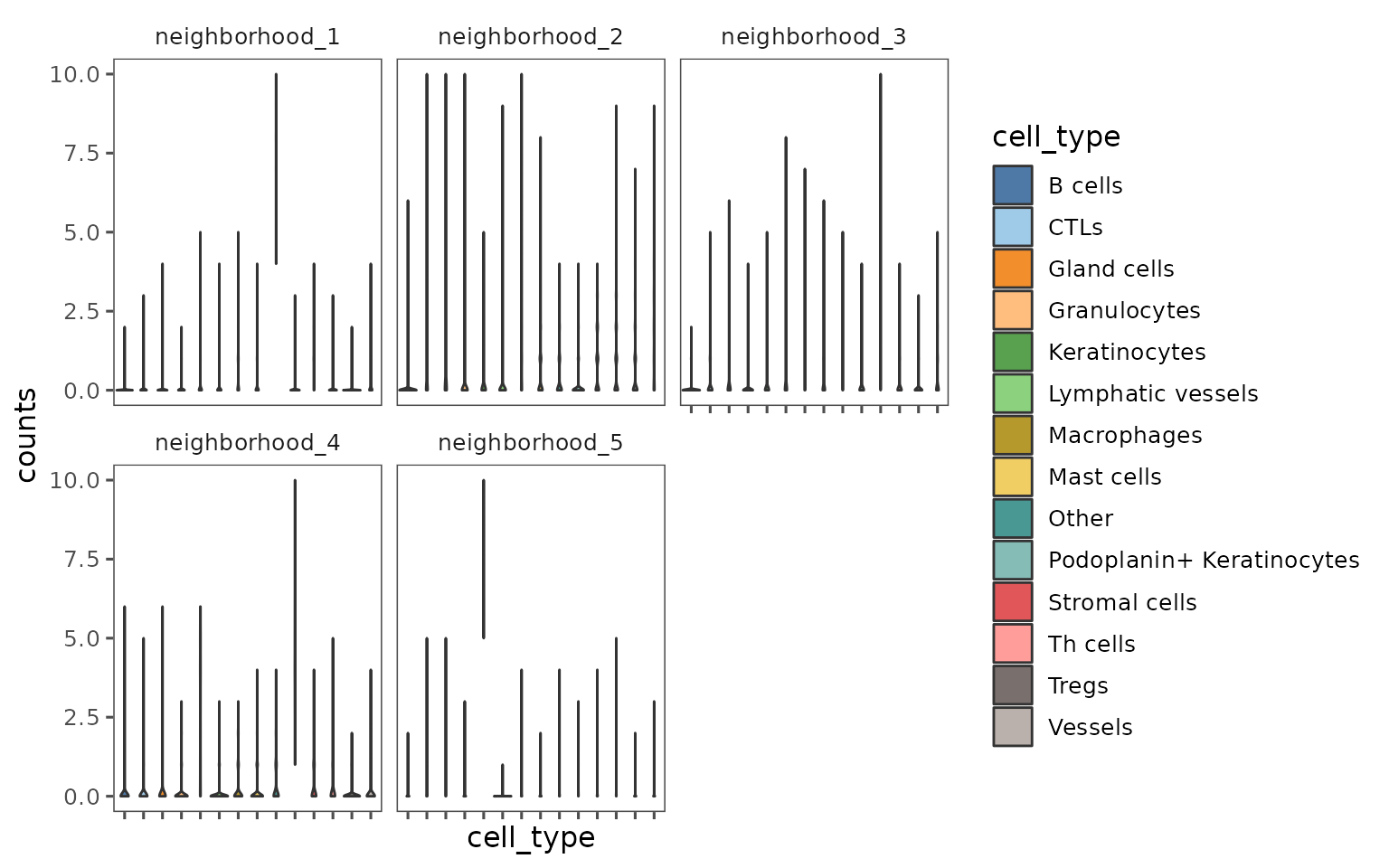
Conclusion
As mentioned in the introduction, most of the functions shown here return ggplot objects that can be augmented using ggplot functions and syntax! For a good introduction to using ggplot, check out this guide!
Some brief examples of some modifications you can make:
Adding lines to indicate significance cutoffs.
plotCohortsVolcano(cohort_result) +
  ggplot2::geom_hline(yintercept = -log10(0.05),
                      linetype = "dotted",
                      color = "red") +
  ggplot2::geom_vline(xintercept = c(-1, 1),
                      linetype = "dotted",
                      color = "blue")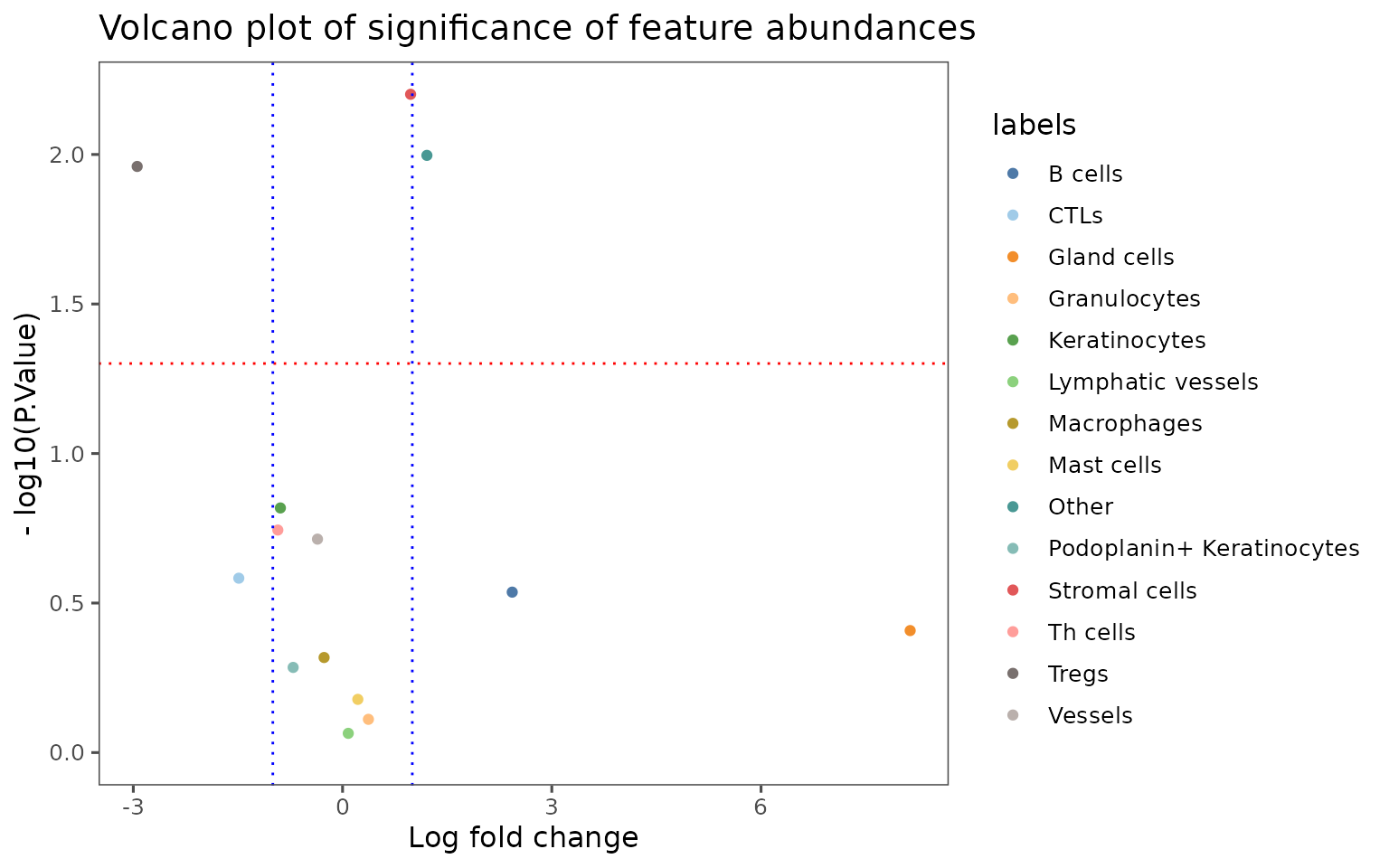
Changing color scheme.
plotRepresentation(sm[[1]],
                   representation = "spatial",
                   what = "PanCK",
                   data.slot = "ScaledData",
                   # Can specify a "trim" parameter for continuous variables
                   # to prevent outliers from washing out the color scale
                   trim = c(0.01, 0.95)) +
  ggplot2::scale_color_viridis_c()
#> Scale for 'colour' is already present. Adding another scale for 'colour',
#> which will replace the existing scale.