Plot Cell Proportions
plotCellProportions.RdTakes a SpatialMap or Region object, extracts cellMetadata, and plots the proportions of 'var1' cells across 'var2'. Var1 will be treated as separate groups, and Var2 will be represented as fill colors. Any output can be modified as a ggplot object. Examples shown below.
Usage
plotCellProportions(
  object,
  var1,
  var2,
  type = "bar",
  pos = "auto",
  filter.eval = NULL,
  var_sample = "Region",
  select_var1 = NULL,
  select_var2 = NULL,
  sample_props = TRUE
)
Arguments
- object
SpatialMap or Region object
- var1
Variable name from cellMetadata or projectMetadata. Defines groups on the x axis (
aes(x = var1)to paraphraseggplot2syntax).- var2
Variable name from cellMetadata or projectMetadata. Defines groups that will be indicated by different fill colors (
aes(fill = var2)to paraphraseggplot2syntax).- type
(optional) Specifies type of graph to create. Graph type can be "bar", "box", "violin", or "strip_chart" (default="bar").
- pos
(optional)
positionargument passed togeom_*function. For example, if type=="bar" then pos is passed togeom_barasgeom_bar(..., position = pos).- filter.eval
A quoted character string that will be parsed and evaluated by
rlang::parse_exprwithin a dplyrfilter- var_sample
(optional) variable used to demarcate samples for strip charts, violin charts, or box charts(default="Region")
- select_var1
Used to select which items from var1 should be included in the graph. (default = NULL, meaning no items excluded from final chart).
- select_var2
Same as "select_var1", except for var2.
- sample_props
(optional) Whether to plot cell proportions within
var_sample(default = TRUE). If TRUE and type=="bar", the mean cell proportions will be plotted. If FALSE, cell counts will be plotted instead.
Details
See vignette("AnalysisGuide7_Cohort_comparison") for an example workflow that uses this function.
Examples
library(ggplot2)
sm <- load_sm_data("skin")
sm <- mergeProjectMetadata(sm)
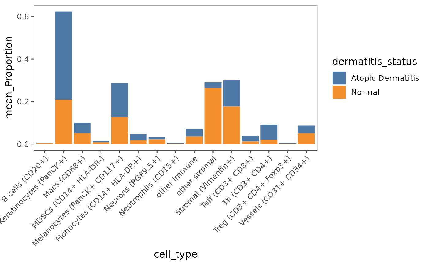
plotCellProportions(sm,
var1 = "cell_type",
var2 = "dermatitis_status")
 # Add your own ggplot parameters and graph titles
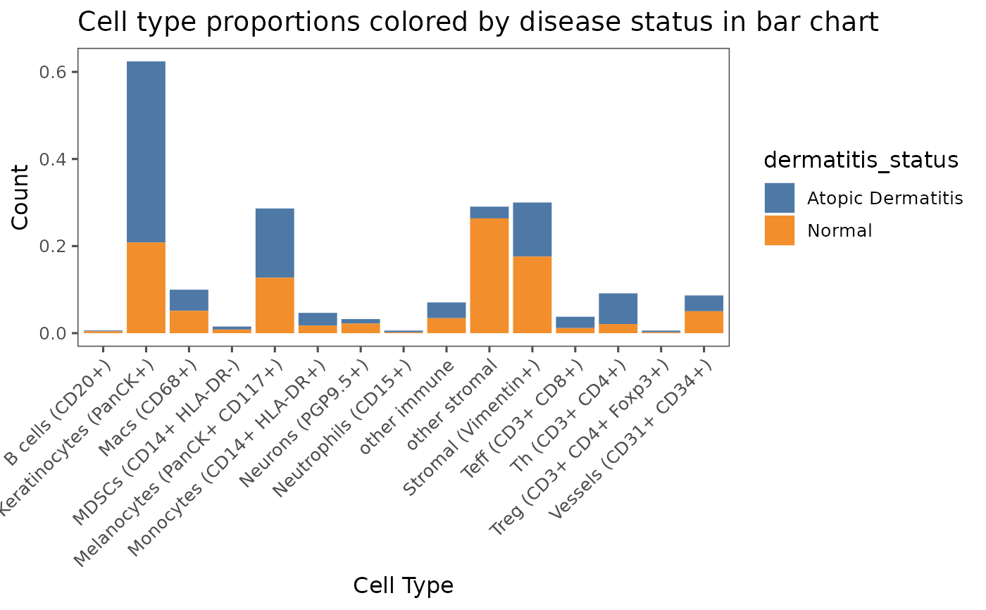
plotCellProportions(sm,
var1 = "cell_type",
var2 = "dermatitis_status",
type = "bar") +
labs(title = "Cell type proportions colored by disease status in bar chart",
x = "Cell Type",
y = "Count")
# Add your own ggplot parameters and graph titles
plotCellProportions(sm,
var1 = "cell_type",
var2 = "dermatitis_status",
type = "bar") +
labs(title = "Cell type proportions colored by disease status in bar chart",
x = "Cell Type",
y = "Count")
 # Plot multiple types of graphs by using `type` parameter
# `type` can be set to: "bar", "box", "violin", or "strip_chart"
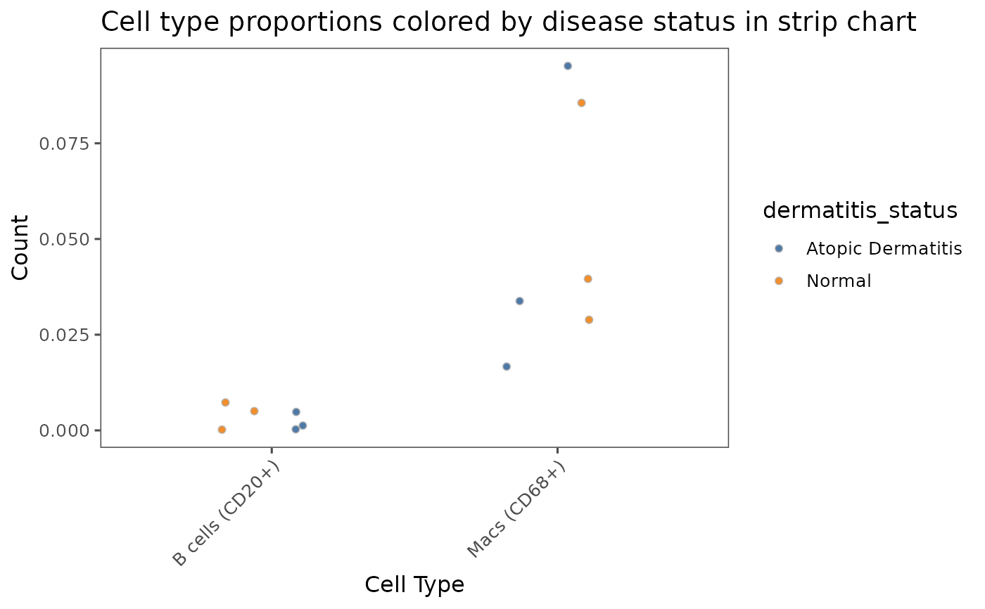
plotCellProportions(sm,
var1 = "cell_type",
var2 = "dermatitis_status",
type = "strip_chart",
select_var1 = c("B cells (CD20+)", "Macs (CD68+)")) +
labs(title = "Cell type proportions colored by disease status in strip chart",
x = "Cell Type",
y = "Count")
# Plot multiple types of graphs by using `type` parameter
# `type` can be set to: "bar", "box", "violin", or "strip_chart"
plotCellProportions(sm,
var1 = "cell_type",
var2 = "dermatitis_status",
type = "strip_chart",
select_var1 = c("B cells (CD20+)", "Macs (CD68+)")) +
labs(title = "Cell type proportions colored by disease status in strip chart",
x = "Cell Type",
y = "Count")