Analysis Guide VI
Describing Cell Neighborhoods
AnalysisGuide6_Neighborhoods.RmdNavigate vignettes
Introduction
The pairwise cell-cell interaction analysis in the previous Analysis Guide is effective at capturing relatively simple types of interactions that can occur in a tissue. However, there may be higher order structures in the tissue that are represented by characteristic combinations of cell types or microenvironments.
One approach to detect these types of higher order tissue structures is the neighborhood analysis first described by Schurch et al. in their seminal work “Coordinated cellular neighborhoods orchestrate antitumoral immunity at the colorectal cancer invasive front.”, published in Cell. In this work, they started by defining “windows” for each cell, consisting of that cell’s 10 nearest neighbors. To identify neighborhoods in the tissue structure, they performed k-means clustering to identify sets of cells with similar cell type composition in their “windows”. Cells that have similar sets of neighbors were subsequently grouped into “neighborhoods”.
This analysis is illustrated below. Each color in the nearest neighbor graph indicates a different cell type, with each cell connected to its neighbors by black lines. You can see that the graph is roughly divided in two: a neighborhood enriched for yellow and red cells in the upper right, and neighborhood enriched for green and purple cells in the lower left. By identifying cells that have predominantly red/yellow neighbors and green/purple neighbors, we can locate areas of this tissue that are dominated by the interactions between these cell types.

This workflow, in addition to tools for the visualization of the resulting neighborhoods, are conveniently abstracted in SpatialMap.
Import data
The cell phenotypes were determined in Analysis Guide 3-4, and the nearest neighbor graph "spatial_knn_10" was generated in Analysis Guide 5. We start this vignette by picking up where they left off.
data_file <- "sm_pairwise_interactions.RDS"

data_dir <- "."
# facil::check_dir is useful if you're running this yourself on code ocean
rw_paths <- facil::check_dir(data_dir)

sm <- readRDS(file.path(rw_paths$read_dir, data_file))
You can recreate this analysis yourself on Code Ocean by attaching the “SpatialMap vignettes” data asset to your capsule and changing
data_dirto/data/spatialmap_vignettes/spatialmap_analysis_guides/
Neighborhood analysis
Finding neighborhoods
Since the nearest neighbor graph has already been calculated, we pick up the neighborhood analysis at the second step, finding the composition of each cell’s local neighbors.
sm <- cellNeighborhoods(sm,
                        nn = "spatial_knn_10",
                        feature = "clustering_with_macrophage_subtypes")
We then perform k-means clustering of these cells based on the composition of their local neighborhoods. Cells with similar neighbors will be grouped together into a single neighborhood, representing a region of the tissue dominated by a characteristic composition of cell types.
K-means clustering looks for a specific number of clusters defined in the input, but we would ideally like a data-driven approach to determining the true number of clusters in the data. One commonly used heuristic to determine the optimal number of clusters to use for k-means is the silhouette score. If a given clustering result has a high silhouette score, cells in each cluster are more similar to other cells in their cluster than they are to cells in other clusters, suggesting that the clustering algorithm has done a good job of partitioning the cells along natural divisions in the data.
The SpatialMap function neighborhoodClusters can be run without specifying a value of k. If so, it will use the silhouette score to find the optimal number value of k, and also plot out the value of the silhouette score vs the value of k for a range of values.
set.seed(72184)

sm <- neighborhoodClusters(sm,
                           nn = "spatial_knn_10",
                           feature = "clustering_with_macrophage_subtypes")
#> Warning: did not converge in 10 iterations

#> Warning: did not converge in 10 iterations

#> Warning: did not converge in 10 iterations

#> Warning: did not converge in 10 iterations
Visualizing neighborhoods
We can start by looking at the spatial organization of these neighborhoods in one of the regions of this dataset.
reg <- sm[[1]] # Just looking at the first region in the dataset

plotRepresentation(reg,
                   "spatial",
                   "clustering_with_macrophage_subtypes")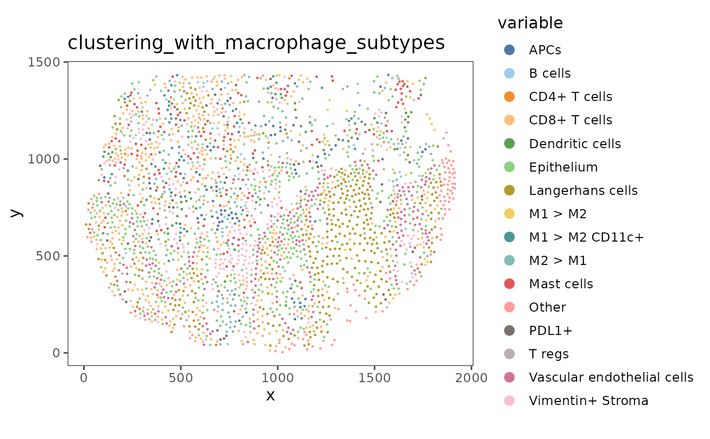
plotRepresentation(reg,
                   "spatial",
                   "nh_spatial_knn_10_clustering_with_macrophage_subtypes")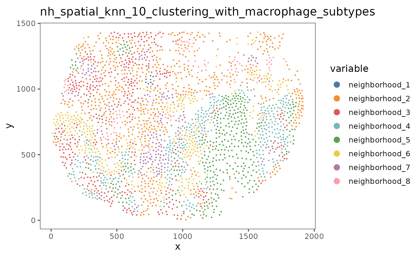
We can use the function neighborhoodHeatmap to get a more complete view of the composition of these neighborhoods in the entire dataset. By default, the function neighborhoodHeatmap groups each of the cells by neighborhood and plots the composition of each cell’s neighbors, with each row representing an individual cell and each column showing the number of neighbors that cell has of each of the cell types. This gives a cell level picture of the composition of each neighborhood.
neighborhoodHeatmap(sm,
                    nn = "spatial_knn_10",
                    feature = "clustering_with_macrophage_subtypes",
                    subsample = 2000,
                    ## Adding some padding so text doesn't get cut off
                    bottom_pad = 1.5,
                    right_pad = 1,
                    left_pad = 1)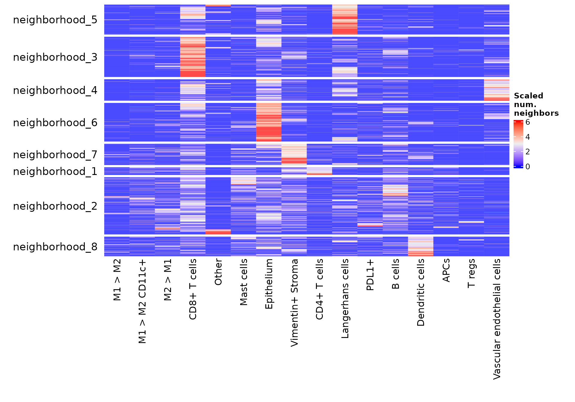
Note: by default,
neighborhoodHeatmapcuts off the 1st and 99th percentile of data in the heatmap, so that the color scale shows the majority of the dynamic range clearly. To change this, you can use the argumentcuts. Thesubsampleparameter speeds up this visualization by randomly selecting a subset of the cells to show in this heatmap. Subsampling to this many cells often doesn’t impact the interpretability of this heatmap. See?neighborhoodHeatmapfor more details on this function.
You can also create a summarized view of this heatmap by setting summarize = TRUE. Scaling by "row" highlights which cell types are the most prevalent in each neighborhood.
neighborhoodHeatmap(sm,
                    nn = "spatial_knn_10",
                    feature = "clustering_with_macrophage_subtypes",
                    summarize = TRUE,
                    scaling = "row",
                    cluster_rows = FALSE,
                    row_names_side = "left",
                    bottom_pad = 1.5,
                    right_pad = 1,
                    left_pad = 0.5)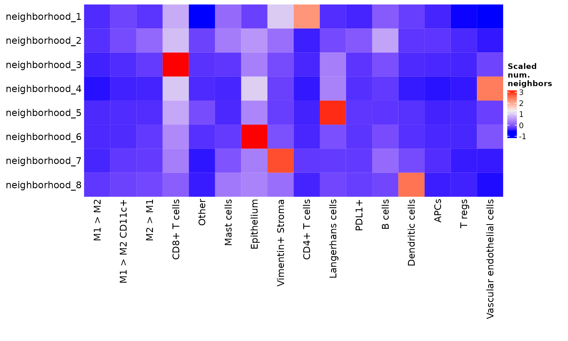
While scaling by columns ("col") highlights where each of the cell types are most represented.
neighborhoodHeatmap(sm,
                    nn = "spatial_knn_10",
                    feature = "clustering_with_macrophage_subtypes",
                    summarize = TRUE,
                    scaling = "col",
                    cluster_rows = FALSE,
                    row_names_side = "left",
                    bottom_pad = 1.5,
                    right_pad = 1,
                    left_pad = 0.5)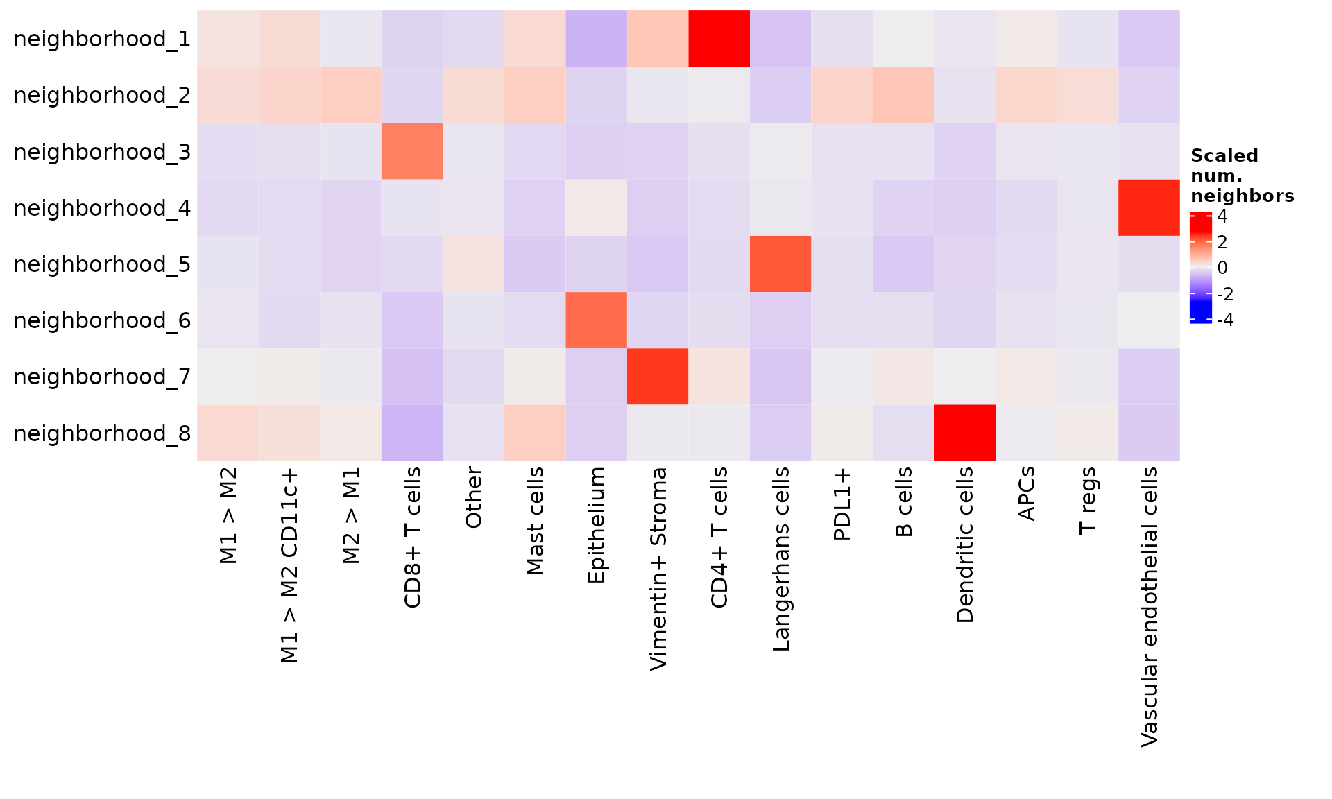
From these visualizations, we can conclude that neighborhood 1 represents epithelium, neighborhood 2 represents T cell-dominant areas, and neighborhood 3 represents vasculature and perivascular infiltrate. As with cell phenotypes, we can re-label these neighborhoods to reflect our interpretation.
neighborhood.labels <- c(
  neighborhood_1 = "Epithelium",
  neighborhood_2 = "T cell-dominant",
  neighborhood_3 = "Vasculature and perivascular infiltrate"
)

raw_values <- as.character(cellMetadata(sm)$nh_spatial_knn_10_clustering_with_macrophage_subtypes)

mapped.vals <- mapValues(raw_values, neighborhood.labels)
#> Warning: mapping returned 11915 NA values
sm <- sm %>% addCellMetadata(mapped.vals, col.names = "Annotated neighborhoods")
Finally, we save our progress, and proceed to the final part of this analysis guide–cohort comparisons.