Analysis Guide Part II
Quality Control of Single Cell Spatial Data with SpatialMap
AnalysisGuide2_QC_with_SpatialMap.RmdNavigate vignettes
Reading in data
We will start by reading in our dataset, which was pulled from ATLAS in part 1 of the analysis guide.
data_file <- "sm_preQC.RDS"

data_dir <- "."
# facil::check_dir is useful if you're running this yourself on code ocean
rw_paths <- facil::check_dir(data_dir)

sm <- readRDS(file.path(rw_paths$read_dir, data_file))
You can recreate this analysis yourself on Code Ocean by attaching the “SpatialMap vignettes” data asset to your capsule and changing
data_dirto/data/spatialmap_vignettes/spatialmap_analysis_guides/
Set DNA channel
The quality control (QC) functions written into SpatialMap make use of the channels used for the nuclear stain to calculate some metrics.
DNA_CHANNEL <- "DAPI"If your data was generated by Enable’s lab, your nuclear stain is DAPI. If you are analyzing a dataset that was acquired elsewhere, you may have a different DNA stain. If this is the case, you will have to specify the channel used as your nuclear stain in the
neutral.markersargument ofspatialmap_from_dbto use it in QC. See?spatialmap_from_dbfor more information on this argument.
The QC metrics
SpatialMap calculates four metrics to use for quality control.
signal.sum: The sum of all the biomarker values for each cell.DNA: The total signal in the DNA channel for each cell.cell.size: The area in pixels of the segmentation mask for each cell.signal.CV: The least intuitive metric, this is the coefficient of variation (CV) of the vector of biomarker values for each cell. The CV is calculated as the standard deviation divided by the mean. The CV could be low if a cell’s values for all of the biomarkers are very similar (e.g. a brightly fluorescent artifact). Conversely, the CV could be high if a single channel has an aberrantly high value (e.g. an artifact that only impacts a single channel, like an antibody aggregate). A normal cell will have some bright biomarkers and some dim biomarkers.
In general, cells that are outliers in the distributions of these metrics are good to filter out, since they are likely to have been stained or imaged poorly.
The function QCMetrics calculates these values for each cell in your SpatialMap object, and the function FilterCodex determines which cells are outside the current QC threshold values.
sm <- QCMetrics(sm, DNA = DNA_CHANNEL) %>%
  FilterCodex()
#> Calculating quality control metrics...
#>
#> Filtering cells...
#>
Visualizing QC results
plotQCSummary will generate density plots showing the distribution of all the cells in your sm object for each of the QC metrics. Vertical red lines show the current values of the QC filters. By default, one density plot is generated per experiment.
qcsum <- plotQCSummary(sm)

qcsum[[1]] + qcsum[[2]] + qcsum[[3]] + qcsum[[4]]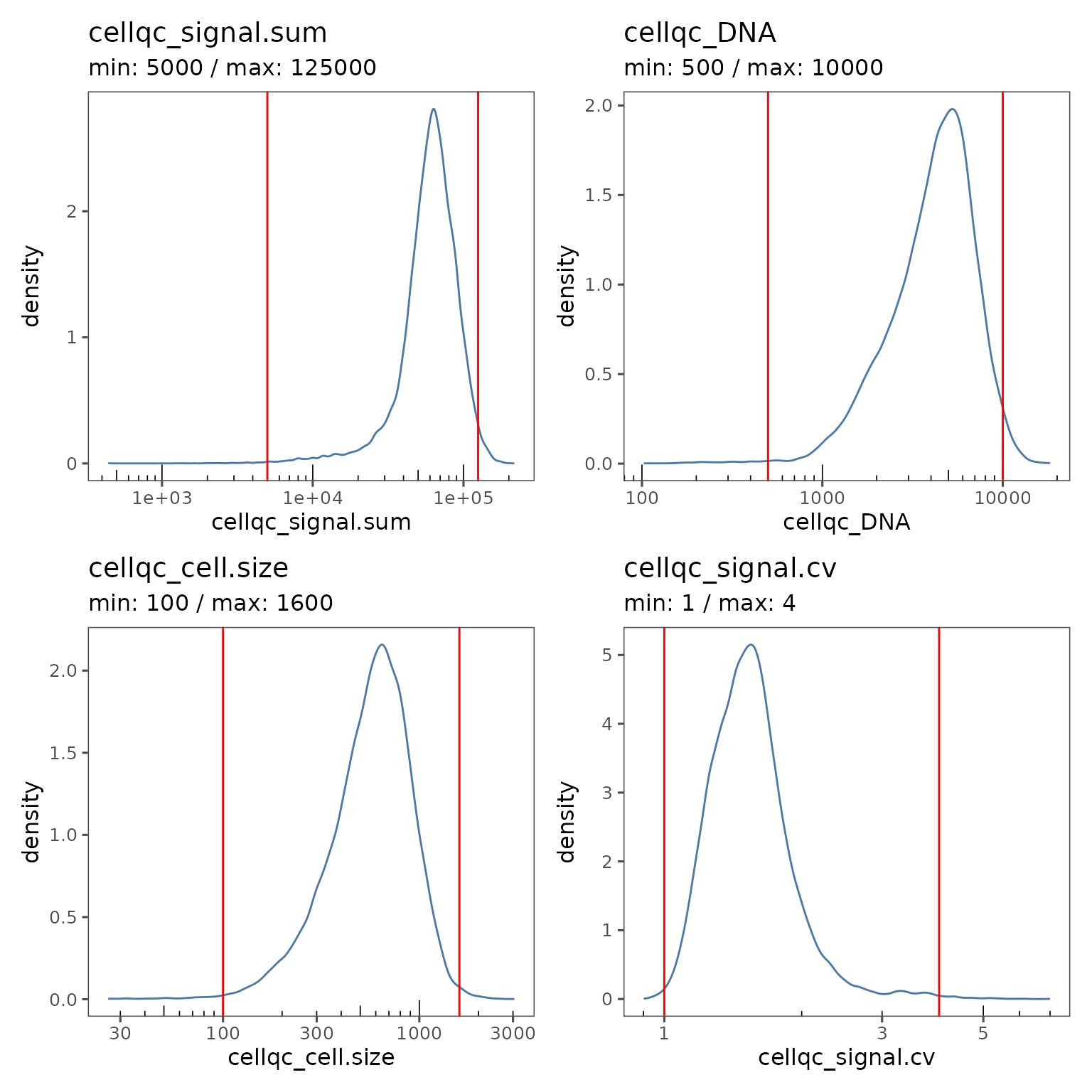
We’re using
patchworksyntax here to make the plots arrange nicely together!
This experiment level view can be a useful summary if you have multiple experiments in your study.
You can also generate a separate curve on the plot for each region by using the group.variable argument.
qcsum <- plotQCSummary(sm, group.variable = "region_display_label")

qcsum[[1]] + qcsum[[2]] + qcsum[[3]] + qcsum[[4]]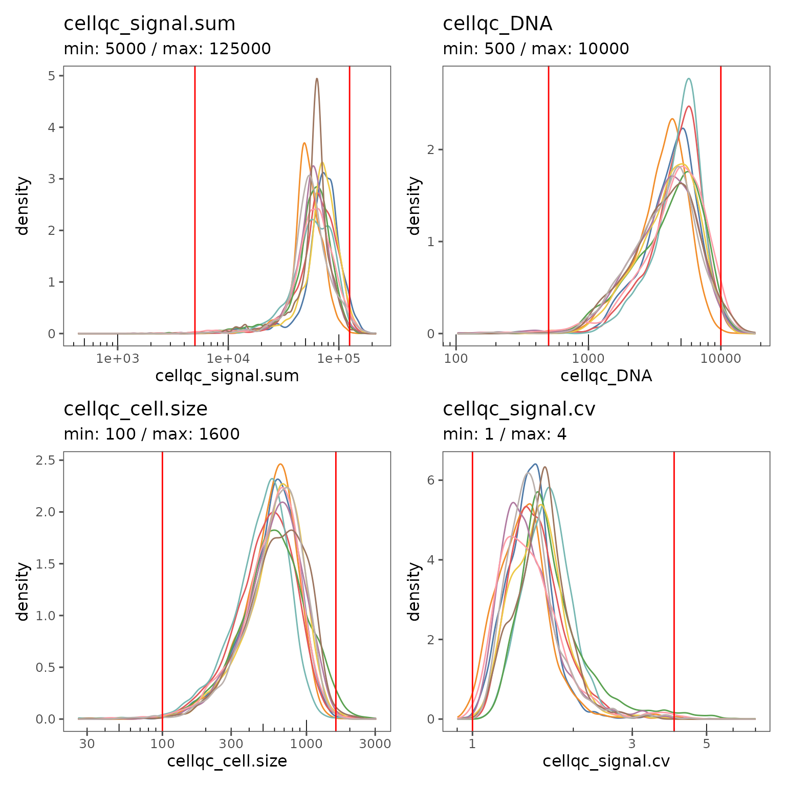
The region level view is great for visualizing the impact of the current filter settings on regions with unusual characteristics.
You can visualize the proportion of cells failing on each QC metric with plotFilterSummary, which can also be grouped by different variables.
pfs <- plotFilterSummary(sm, group.variable = "region_display_label")

pfs[[1]] /
  (pfs[[2]] | pfs[[3]])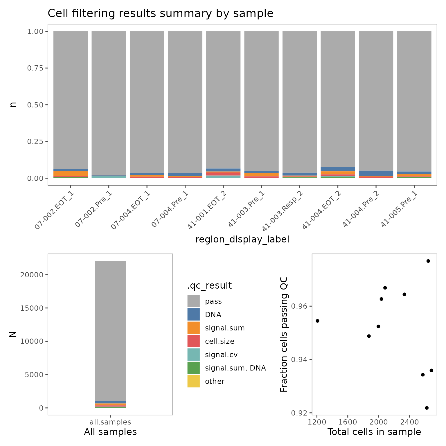
The first plot shows the proportions of cells from each group that falls outside the current QC filters. The second plot shows the proportions of cells from the entire sm object. These plots are colored by which QC filter is responsible for excluding what fraction of cells, or which set of filters if some cells are outside multiple filter thresholds. E.g. the color red in the plots shown above indicate the fraction of cells that are outside both the signal.sum and DNA thresholds. Categories with fewer than 50 cells will be marked "other".
These plots can be useful for identifying troublesome regions, and identifying whether cells are being excluded by multiple metrics.
The final plot shows the relationship between the total number of cells in each group and the percentage of cells failing QC.
Adjusting QC thresholds
Often, the default QC thresholds are not perfectly appropriate for a dataset. If you see clear multimodal distributions, try adjusting the thresholds such that the major mode is within the thresholds and the minor modes are excluded.
You can adjust the QC thresholds for your sm object by changing the settings.
new.settings <- c(
  min_signal.sum = 20000,
  max_signal.sum = 150000,
  min_DNA = 1500,
  max_DNA = 15000,
  min_cell.size = 150,
  max_cell.size = 1600,
  min_signal.cv = 1,
  max_signal.cv = 3
)

settings(sm, names(new.settings)) <- new.settings
You can then apply the filters by running FilterCodex again, and visualize the impact of the new thresholds.
sm <- FilterCodex(sm)
#> Filtering cells...
#>
qcsum <- plotQCSummary(sm, group.variable = "region_display_label")
qcsum[[1]] + qcsum[[2]] + qcsum[[3]] + qcsum[[4]]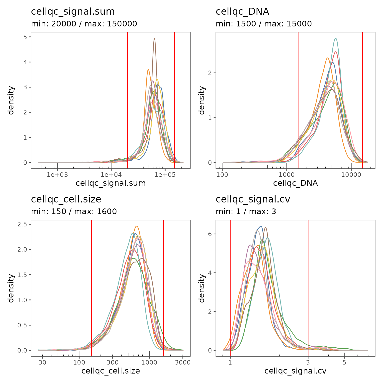
pfs <- plotFilterSummary(sm, group.variable = "region_display_label")
pfs[[1]] /
  (pfs[[2]] | pfs[[3]])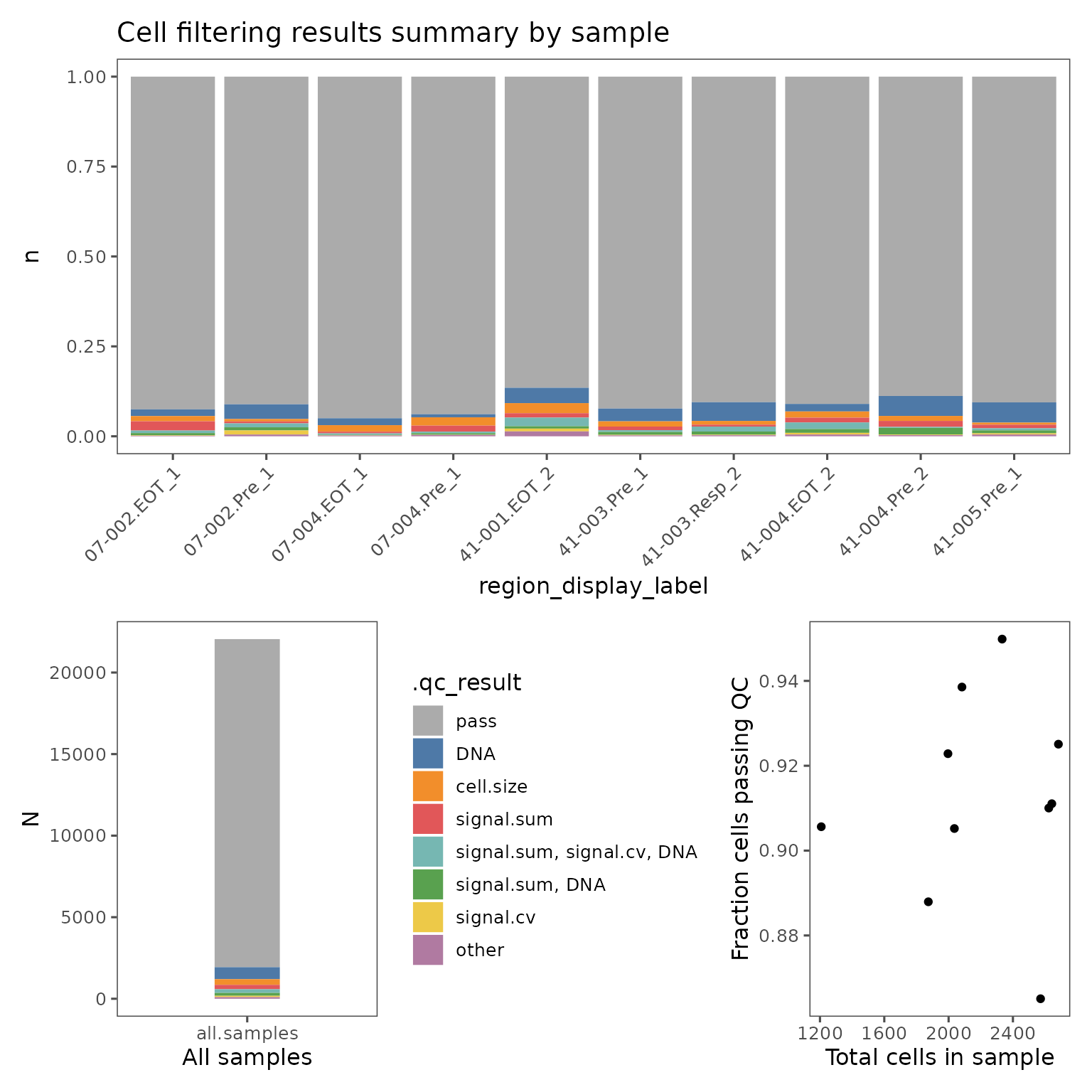
You may have to iteratively update the thresholds and visualize the results until you have found the optimal values.
If some regions are distinctly outside the distribution of the rest of the dataset, it can be useful to look at the staining quality of those regions in the visualizer. You can also visualize the spatial distribution of cells that fail QC using SpatialMap, and compare those images to the visualizer to see whether the filtered cells are in a part of the image with visually problematic features.
filter_plots <- plotFilteredCells(sm,
                                  plot.titles.from = "region_display_label")
The values in this list are named by each region’s acquisition_id, a database identifier that is guaranteed to be unique across the entire ATLAS. If you are working from only a single study, it’s usually more convenient to use the region_display_label which is the label used on the Portal.
RDLs <- projectMetadata(sm)$region_display_label

names(filter_plots) <- RDLs
You can now use $ indexing to easily find each of the plots by their region_display_label, E.g:
filter_plots$`07-002.Pre_1`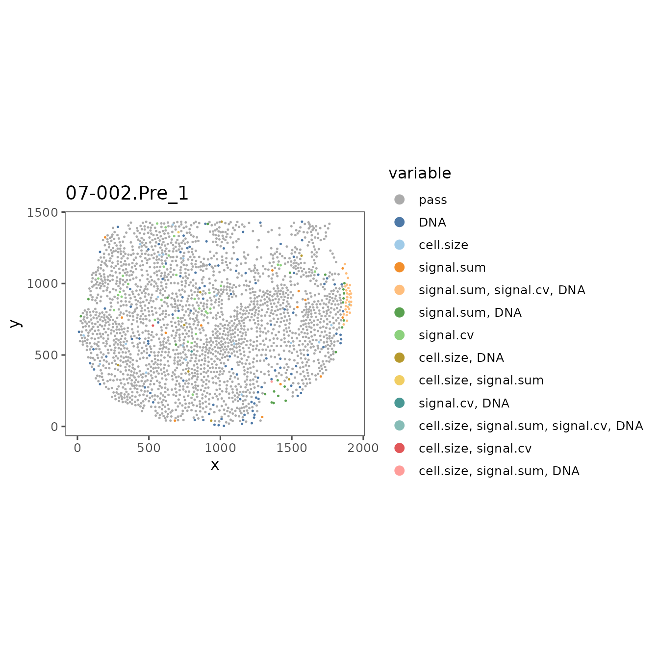
Use these plots and refer back to the images in the Visualizer, and adjust the QC thresholds until you are including the majority of the good quality cells and excluding the poor quality cells.
The Insights module on the Portal is a powerful tool for organizing and presenting plots generated on Workbench. Pushing these QC plots from the vignette may make it easier to refer to them as you are checking the results in the visualizer.
STUDY_NAME <- projectMetadata(sm)$study_name[[1]]

emconnect::upload_image(
  pfs[[1]],
  file.name = "cell_filter_summary_by_region.png",
  card.title = "Filter summary plots",
  study_name = STUDY_NAME,
  plot.description = "Results of cell filtering on workbench",
  # You may want to try multiple iterations of uploading
  # with different values of height and width to find optimal values
  height = 7,
  width = 7,
  units = "in",
  res = 150
)
You can find more information on this process in the Tutorial vignette Pushing plots to the portal.
You can also generate an overlay in the Visualizer by uploading the QC results using uploadQC. This will also make the filter available for use by any app on the Portal that makes use of QC filters (Unsupervised Clustering, Gating, Explorer, etc.), and help these Portal apps appropriately handle any cell annotations you push from Workbench that are generated after using these filters.
uploadQC(
  object = sm,
  uploaded_name = "QC result from workbench"
)
Once you have settled on optimal values, you can exclude poor quality cells from your next analysis steps on Workbench using FilterCodex.
NOTE: The data on these cells will no longer be maintained in your sm object after this step
# Change the header to eval = TRUE if you're working on your own data
sm <- FilterCodex(sm, remove.filtered.cells = T, recompute = F)
Now that you have filtered out the poor quality cells from your dataset, you’re ready to proceed to unsupervised clustering.
Appendix
If you find you are unable to find optimal global QC values that work well for your whole dataset using SpatialMap, you can try making your QC filters using the QC app on the portal. This page in the user manual describes how to use that app. The global values you determine using SpatialMap can be a good starting point for your optimization on the Portal.
Once you have “exported” your filters from the QC app, they will be automatically pulled in by spatialmap_from_db. You can then filter your SpatialMap object using FilterCodex by specifying the name of the annotation set.
QC_anno_colname <- "anno1970_QC.filters"

QC_anno_data <- cellMetadata(sm)[[QC_anno_colname]]
QC_anno_logical <- QC_anno_data == "pass"
sm <- addCellMetadata(sm, metadata = QC_anno_logical,
                      col.names = ".pass_qc")

sm <- FilterCodex(sm, qc.var = QC_anno_colname, remove.filtered.cells = TRUE, recompute = F)
#> Filtering cells...
#>