Analysis Guide Part V
Describing Cell-Cell Interactions
AnalysisGuide5_Cell_interactions.RmdNavigate vignettes
Introduction
The analysis of spatial interactions is central to the SpatialMap package and unlocks the full power of multiplexed immunofluorescence and spatial transcriptomics data. The goal of spatial analysis is to identify cell types that are in spatial proximity in the tissue, representing cells that are most likely working together to produce a functional output. There are several approaches one can take to profiling the spatial interactions between cell types in a tissue. In this vignette, we are focused on analyzing pairwise interactions between cell types. E.g. do CD4+ T cells and B cells interact in a given region more than would be expected if they were randomly distributed throughout the tissue?
Import data
The starting point for any analysis of spatial interactions is the cell phenotyping we worked through in the first four Analysis Guide vignettes. So, we start by loading the output saved by the previous vignette.
data_file <- "sm_subclustered.RDS"

data_dir <- "."
# facil::check_dir is useful if you're running this yourself on code ocean
rw_paths <- facil::check_dir(data_dir)

sm <- readRDS(file.path(rw_paths$read_dir, data_file))

# This will make it easier to watch the progress of
# the spatial calculations performed later in this vignette
settings(sm, "show.progress") <- TRUE
You can recreate this analysis yourself on Code Ocean by attaching the “SpatialMap vignettes” data asset to your capsule and changing
data_dirto/data/spatialmap_vignettes/spatialmap_analysis_guides/
Computing cell-cell interactions
The first step for most spatial analyses is to decide what constitutes a cell interaction. SpatialMap includes several methods for calculating this, which are described in more detail in the tutorial vignette “Advanced spatial analysis”. For simplicity, we will be using the K-nearest neighbors or “knn” based approach for defining which cells interact. We will specify a value, k, and the algorithm will then search the tissue for each cell’s nearest neighbors up to k neighbors. The optimal value of k can depend on your tissue, but a common starting point is between 8-15.
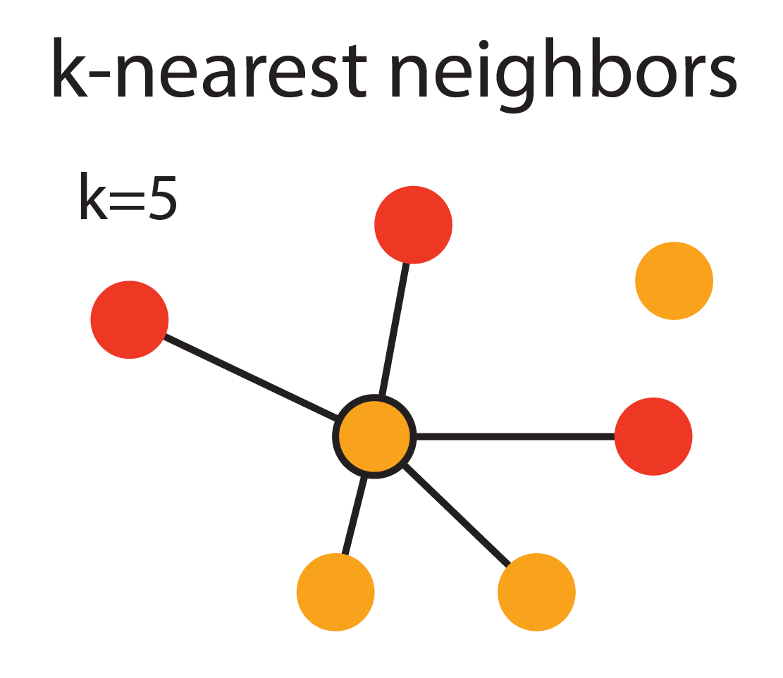
The figure above demonstrates the KNN approach with k = 5. The different colored dots represent cells of different phenotypes. The central cell is connected to its 5 nearest neighbors by solid black lines.
We will use a value of k = 10 to find each cell’s neighbors.
sm <- spatialNearestNeighbors(sm,
method = "knn",
k = 10,
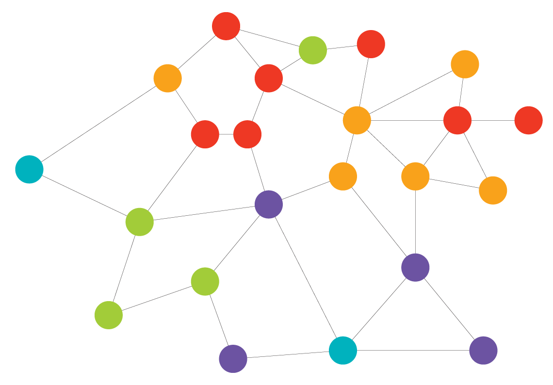
name = "spatial_knn_10")After this calculation is complete, we will have generated a graph that functions as an abstraction of the underlying data. Each of the cells in the tissue are represented by nodes (dots) in this graph, while the edges (lines) connect each cell with its neighbors. This graph will be stored in the sm object with the name "spatial_knn_10".
Pairwise Adjacency
With this nearest neighbor network calculated, we can begin to answer questions about the structural organization of cells in this dataset. We’ll start with a basic region-level question–are there any pairs of cell types that interact in a given region more than would be expected if they were randomly distributed throughout the tissue?
We’ll need to decide how the cell interactions (adjacency) will be evaluated statistically - either the hypergeometric test or a permutation test. Both tests control for the relative proportions of cell types (or classes) in each sample, with slightly different assumptions. The hypergeometric is considerably faster, so we’ll use that approach here.
We’ll use the cell phenotyping performed with subclustering that we generated in the fourth analysis guide, "clustering_with_macrophage_subtypes". We will also need to tell the pairwiseAdjacency method the name of the nearest neighbor network to use to evaluate cell interactions.
sm <- pairwiseAdjacency(
  sm,
  method = "hypergeometric",
  feature = "clustering_with_macrophage_subtypes",
  nn = "spatial_knn_10"
)
IMPORTANT NOTE: If your dataset has multiple regions imaged from the same biological sample, you may want to perform this analysis on a sample-level. This is especially important later when
compareAdjacencyis run. You can perform this analysis by specifyinganalyze = "sample_label". See?pairwiseAdjacencyfor more details on this approach.
sm <- pairwiseAdjacency(
  sm,
  method = "permutation", # Consider using permutation for sample-level analyses
  feature = "clustering_with_macrophage_subtypes",
  nn = "spatial_knn_10",
  analyze = "sample_label"
  # In this example dataset there's a 1:1 mapping from regions to samples, so this code is equivalent to the
  # code in the previous chunk.
)
Visualizing results
In this vignette we will focus on exploratory analysis of each region’s interaction statistics. To calculate the differences in cell type interactions for groups of regions, see Analysis Guide 7 “comparing cohorts”.
You can generate a heatmap showing the enrichment of each interaction type (how much more likely a given cell-cell interaction is compared to a random and unorganized tissue) using the function plotPairwiseAdjacency.
First we plot the log2.enrichment. This is the log of the odds ratio of interaction. A log-odds of 1 indicates that the interaction occurs twice as often as would be expected by chance, while a log-odds of -1 indicates that the interaction occurs half as often as would be expected by chance.
NOTE: If you’re performing sample-level analysis, you’ll also need to specify
analyze = "sample_label"here as well, which ensures that only a single plot is generated per-sample, and that plots are titled with the appropriate sample labels.
pa_plots_log2 <- plotPairwiseAdjacency(sm,
                                       nn = "spatial_knn_10",
                                       feature = "clustering_with_macrophage_subtypes",
                                       what = "log2.enrichment",
                                       cluster_rows = F,
                                       cluster_columns = F,
                                       bottom_pad = 1,
                                       left_pad = 1,
                                       top_pad = 0.5,
                                       right_pad = 1.5)

pa_plots_log2[[1]]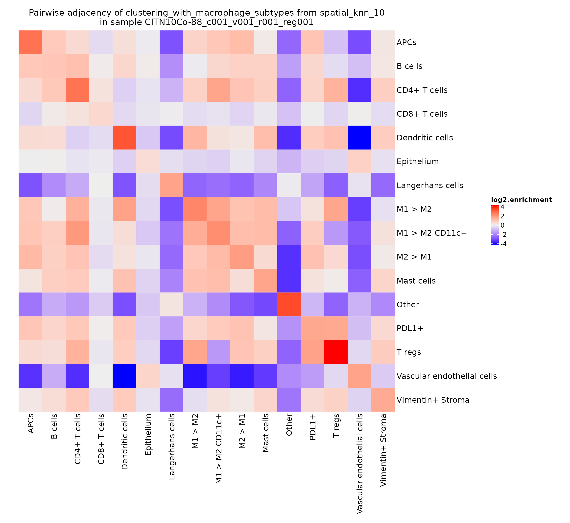
This value can be somewhat noisy, depending on how common the various cell types are in a given region. A typically more robust value to visualize is the -log10 of the adjusted p-value obtained by the hypergeometric test.
pa_plots_logp <- plotPairwiseAdjacency(sm,
                                       nn = "spatial_knn_10",
                                       feature = "clustering_with_macrophage_subtypes",
                                       what = "log10.padj.enrichment",
                                       cluster_rows = F,
                                       cluster_columns = F,
                                       bottom_pad = 1,
                                       left_pad = 1,
                                       top_pad = 0.5,
                                       right_pad = 1.5)

pa_plots_logp[[1]]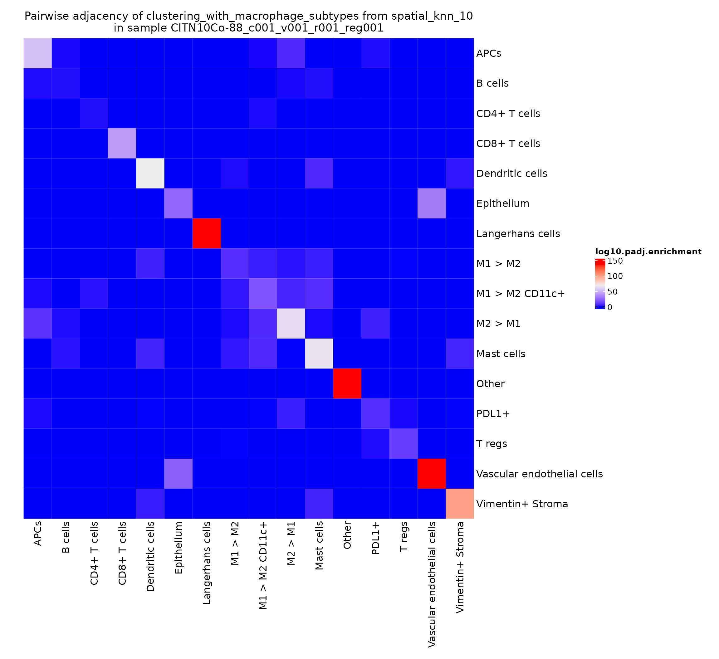
This gives a very intuitive result: epithelial cells are very likely to interact with other epithelial cells as they work together to form the epithelial layer. There’s also a somewhat more surprising result: CD4+ T cells seem to be adjacent to other CD4+ T cells significantly more than would be expected by chance. We can explore this finding further by looking at the heatmaps for other regions in this study.
pa_plots_logp[[2]]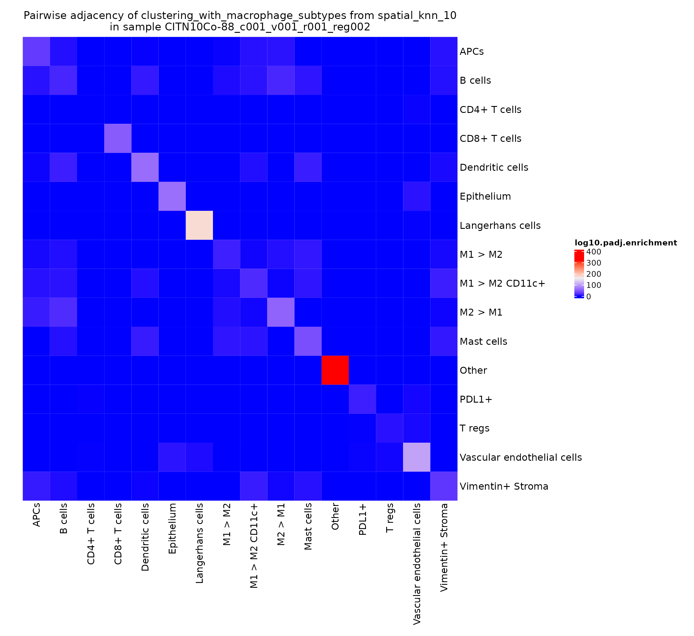
pa_plots_logp[[3]]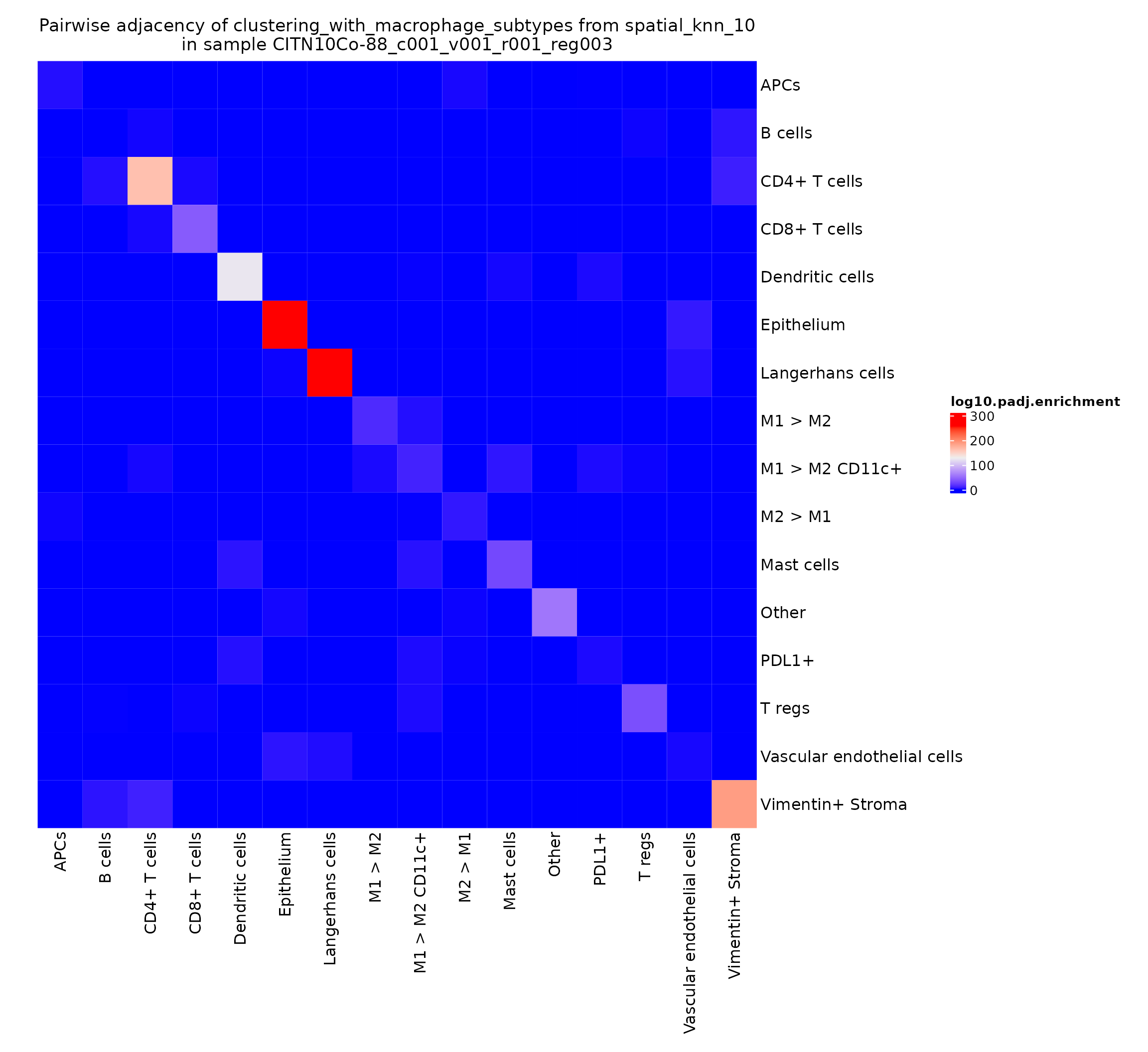
pa_plots_logp[[4]]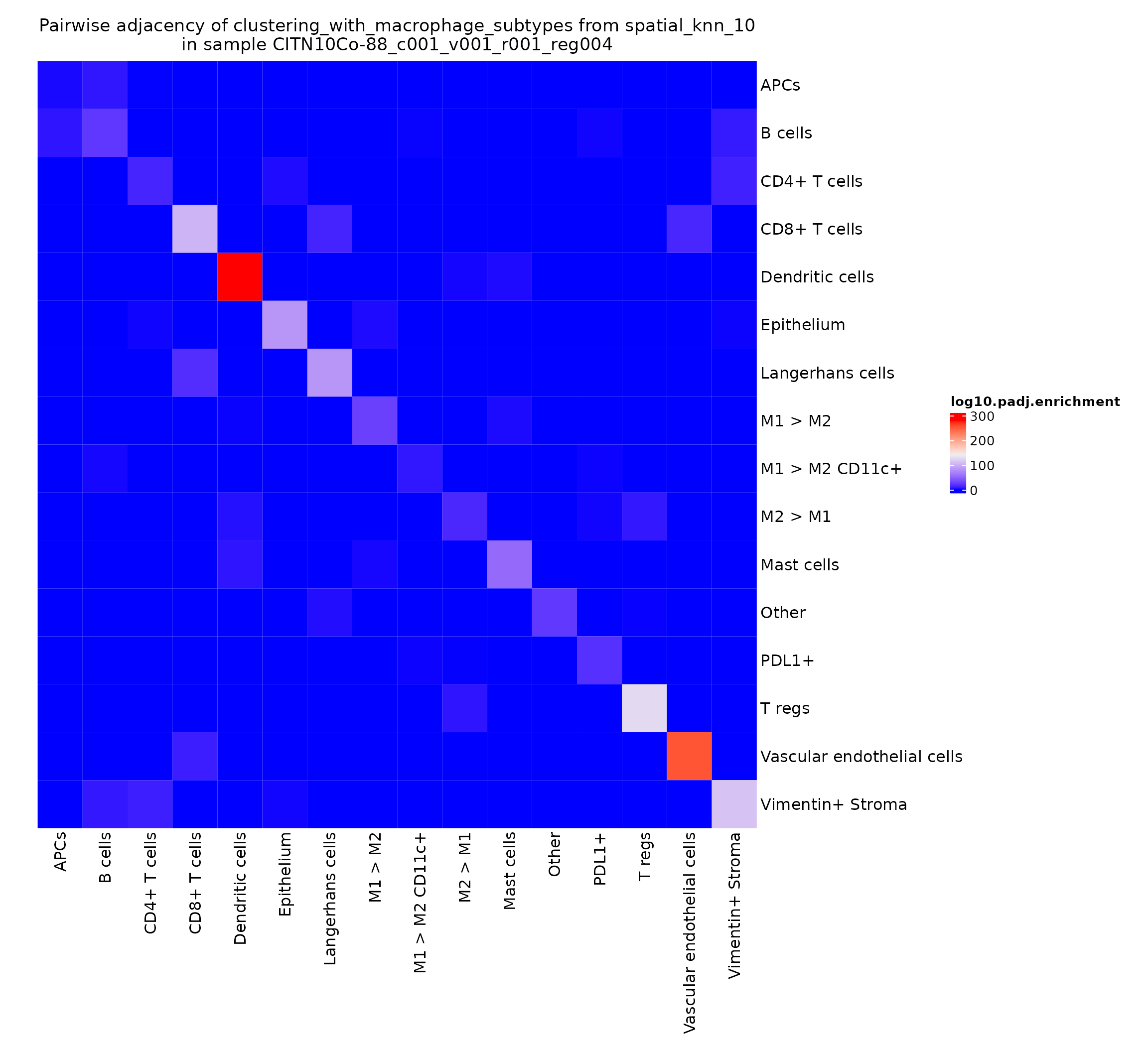
This finding appears to be present in some regions and not others–could be something interesting to investigate when comparing cohorts stratified on clinical metadata.
Finally, we save our progress.